Google Sheets Charts: The Complete Guide
Learn how to create charts in Google Sheets with bar, line, pie, and combo chart examples. Covers chart types, SPARKLINE formulas, and customization tips.
Sheets Bootcamp
February 18, 2026
Charts in Google Sheets turn rows of numbers into visual patterns you can read in seconds. Whether you need a bar chart comparing product categories or a line chart tracking monthly revenue against a target, Sheets has over 20 chart types built in. The charts are live — when your data changes, the chart updates automatically.
This guide covers how to create charts from a monthly sales dataset, walks through bar, line, pie, and combo chart examples, introduces SPARKLINE for inline mini-charts, and covers the customization options that make charts readable.
In This Guide
- What Are Charts in Google Sheets?
- Chart Types Overview
- How to Create a Bar Chart: Step-by-Step
- Line Chart: Actual vs. Target
- Pie Chart: Category Breakdown
- Combo Chart: Bars and Lines Together
- SPARKLINE: Mini Charts in Cells
- Customization Basics
- Common Issues and Fixes
- Tips and Best Practices
- Related Google Sheets Tutorials
- FAQ
What Are Charts in Google Sheets?
Charts are visual representations of your spreadsheet data. Instead of scanning a column of 12 revenue numbers, you see a shape — a rising line, a tall bar, a wedge in a pie — that communicates the pattern instantly.
Google Sheets offers over 20 chart types: bar, column, line, pie, scatter, area, combo, histogram, and more. Each type is designed for a specific kind of comparison. Bar charts compare categories. Line charts show trends over time. Pie charts show proportions of a whole.
Every chart in Sheets is linked to the data range that created it. Change a number in the source cells, and the chart redraws. This keeps your visuals in sync with your data without manual updates.
You create charts through Insert > Chart, or by selecting data and clicking the chart icon in the toolbar. Google Sheets analyzes the selected range and suggests a chart type. You can accept the suggestion or switch to any other type in the Chart Editor sidebar.
Chart Types Overview
Here are the most common chart types in Google Sheets and when to use each one.
| Chart Type | Best For | Example |
|---|---|---|
| Bar / Column | Comparing categories side by side | Revenue by product category per month |
| Line | Trends over time | Monthly total revenue vs. target |
| Pie / Donut | Part-to-whole proportions | Category share of December revenue |
| Scatter | Relationships between two variables | Price vs. units sold |
| Area | Cumulative trends over time | Stacked revenue by category over 12 months |
| Combo | Two data series with different scales or types | Revenue bars with a target line overlay |
| Histogram | Distribution of values across ranges | Revenue frequency across dollar ranges |
| Sparkline | Mini chart inside a single cell | Inline trend for each product category |
For deep dives into specific chart types, see the dedicated guides for bar charts, line charts, pie charts, scatter plots, and combo charts.
Bar charts and column charts show the same data. The only difference is orientation — bar charts use horizontal bars, column charts use vertical bars. Google Sheets groups them under the same menu.
How to Create a Bar Chart: Step-by-Step
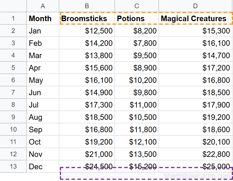
We’ll use a monthly summary table tracking revenue across three product categories at a wizarding supplies shop. The goal: create a bar chart comparing Broomsticks, Potions, and Magical Creatures revenue by month.
Sample Data
The table contains 12 months of revenue data across three categories, plus a Total and Target column.
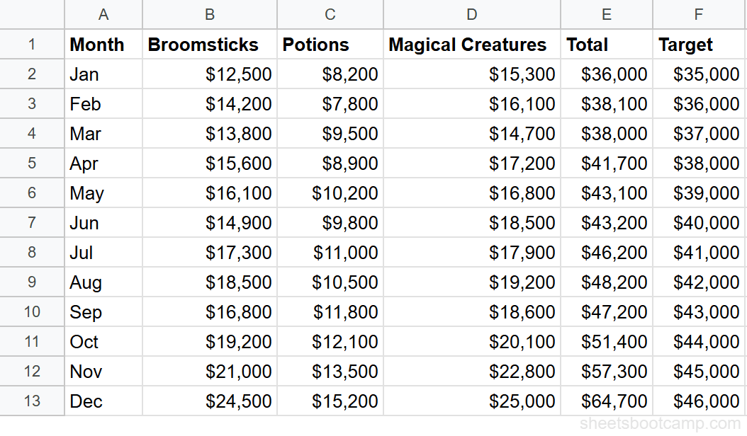
| Month | Broomsticks | Potions | Magical Creatures | Total | Target |
|---|---|---|---|---|---|
| Jan | $12,500 | $8,200 | $15,300 | $36,000 | $35,000 |
| Feb | $14,200 | $7,800 | $16,100 | $38,100 | $36,000 |
| Mar | $13,800 | $9,500 | $14,700 | $38,000 | $37,000 |
| Apr | $15,600 | $8,900 | $17,200 | $41,700 | $38,000 |
| May | $16,100 | $10,200 | $16,800 | $43,100 | $39,000 |
| Jun | $14,900 | $9,800 | $18,500 | $43,200 | $40,000 |
| Jul | $17,300 | $11,000 | $17,900 | $46,200 | $41,000 |
| Aug | $18,500 | $10,500 | $19,200 | $48,200 | $42,000 |
| Sep | $16,800 | $11,800 | $18,600 | $47,200 | $43,000 |
| Oct | $19,200 | $12,100 | $20,100 | $51,400 | $44,000 |
| Nov | $21,000 | $13,500 | $22,800 | $57,300 | $45,000 |
| Dec | $24,500 | $15,200 | $25,000 | $64,700 | $46,000 |
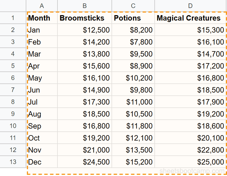
Select your data range
Highlight cells A1 through D13. This includes the header row (Month, Broomsticks, Potions, Magical Creatures) and all 12 rows of data. Sheets uses the first row as labels and the first column as the category axis.
Insert a chart
Go to Insert > Chart. Google Sheets creates a chart on the sheet and opens the Chart Editor sidebar on the right. Sheets analyzes the data structure — one text column (Month) and three numeric columns — and suggests a chart type.
Choose the chart type
In the Chart Editor Setup tab, click the Chart type dropdown. Select Bar chart for horizontal bars, or Column chart for vertical bars. The chart updates immediately, showing three grouped bars per month — one for Broomsticks, one for Potions, and one for Magical Creatures.
December has the tallest bars across all three categories: Broomsticks at $24,500, Potions at $15,200, and Magical Creatures at $25,000.
Customize the chart
Switch to the Customize tab in the Chart Editor. Under Chart & axis titles, set the chart title to something descriptive like “Monthly Revenue by Category.” Add axis titles — “Month” for the horizontal axis and “Revenue ($)” for the vertical axis.
Under Legend, set the position to “Top” or “Right” so readers can identify each data series.
Move and resize the chart
Click the chart and drag it to position it below or beside your data. Drag the corner handles to resize. Hold Alt while dragging to snap the chart edges to cell boundaries.
Select your data before inserting a chart. Sheets auto-detects the range and picks a chart type based on the data structure. Selecting first saves you from manually configuring the data range in the Chart Editor.
Line Chart: Actual vs. Target
Line charts work best for showing trends over time. Here, we’ll plot the monthly Total revenue against the Target to see whether sales stayed on track.
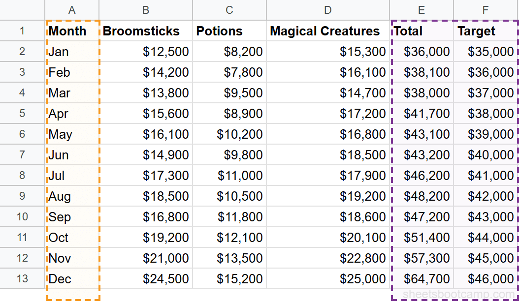
Data Selection
For this chart, you need three columns: Month (A1:A13), Total (E1:E13), and Target (F1:F13). Hold Ctrl (or Cmd on Mac) while clicking to select non-adjacent columns.
Creating the Line Chart
Go to Insert > Chart. In the Chart Editor, select Line chart as the chart type. Two lines appear — one for Total, one for Target.
The Total line starts at $36,000 in January and climbs to $64,700 in December. The Target line runs from $35,000 to $46,000. Total revenue exceeds the target every month, with the gap widening as the year progresses. By December, actual revenue is $18,700 above target.
This makes two things visible at once: the overall growth trend and the margin above target. A table of 24 numbers communicates the same information, but a line chart shows the divergence instantly.
For more on line chart formatting, axis options, and multiple data series, see the full line chart guide.
When you select non-adjacent columns (like A, E, and F while skipping B through D), Google Sheets still constructs the chart correctly. The Chart Editor shows the selected ranges separated by commas in the data range field.
Pie Chart: Category Breakdown
Pie charts show how parts relate to a whole. They work best with a small number of categories — three to five slices stay readable, more than seven becomes crowded.
December Revenue Breakdown
We’ll chart December revenue by category. The three values:
- Magical Creatures: $25,000 (38.6% of total)
- Broomsticks: $24,500 (37.9%)
- Potions: $15,200 (23.5%)
Select the category headers (B1:D1) and the December values (B13:D13). Go to Insert > Chart and select Pie chart from the Chart type dropdown.
The pie chart shows three slices. Magical Creatures and Broomsticks are nearly equal — they account for over 76% of December revenue combined. Potions is the smallest segment at 23.5%.
Switch to the Donut chart variant for a modern look. It’s the same data, same proportions, with a hole in the center. The donut variant also gives you space to display the total ($64,700) in the center.
Pie charts only work well with a few categories. If you have more than five or six slices, the smallest wedges become unreadable. Switch to a bar chart for datasets with many categories — horizontal bars handle long lists cleanly.
For more pie chart patterns including exploded slices and percentage labels, see the pie chart guide.
Combo Chart: Bars and Lines Together
A combo chart combines two chart types — typically bars and a line — on the same plot. This is useful when you want to compare a primary metric against a benchmark or show two related but different-scale data series.
Revenue Bars with Target Line
Select A1:A13 (Month), E1:E13 (Total), and F1:F13 (Target). Insert a chart and choose Combo chart from the Chart type dropdown.
By default, Google Sheets renders the first numeric series (Total) as bars and the second (Target) as a line. The result: monthly revenue bars with a target line running across them. You can see at a glance which months exceeded the target (all of them) and by how much.
To control which series is bars and which is a line, go to the Customize tab > Series. Select a series from the dropdown and change its chart type individually.
For more on combo chart configuration, dual axes, and formatting, see the combo chart guide.
SPARKLINE: Mini Charts in Cells
The SPARKLINE function creates a tiny chart inside a single cell. No Chart Editor, no sidebar, no resizing — the chart lives in the cell and scales to fit. This is useful for showing trends inline with your data.
Basic Line Sparkline
To show the 12-month revenue trend for Broomsticks in a single cell:
=SPARKLINE(B2:B13)This draws a miniature line chart from $12,500 (January) to $24,500 (December), showing the upward trend. The sparkline fits entirely inside the cell.
Bar Sparkline
To show the same data as horizontal bars with a maximum value for scale:
=SPARKLINE(B2:B13, {"charttype","bar"; "max",25000})Each of the 12 values renders as a proportional bar segment. The max option sets the scale ceiling at $25,000, so December’s $24,500 nearly fills the bar.
Sparkline Options
| Option | Values | What It Does |
|---|---|---|
charttype | "line", "bar", "column", "winloss" | Sets the sparkline type |
color | Any hex color | Sets the line or bar color |
linewidth | Number (pixels) | Sets line thickness |
max / min | Number | Sets the axis scale |
empty | "zero", "ignore" | How to handle blank cells |
For advanced patterns including conditional colors and win/loss sparklines, see the full SPARKLINE guide.
SPARKLINE is a formula, not a chart object. It copies, fills, and recalculates like any other function. Drag the fill handle down a column to create sparklines for every row in your table.
Customization Basics
Every chart in Google Sheets has two layers of settings: Setup (what data to chart) and Customize (how it looks). Double-click any chart to reopen the Chart Editor.
Chart Title and Subtitle
In the Customize tab, expand Chart & axis titles. Type a title that describes what the chart shows — “Monthly Revenue by Category” is better than “Chart 1.” You can add a subtitle for additional context, like “January through December 2026.”
Axis Titles and Labels
Set meaningful axis titles under Chart & axis titles. “Revenue ($)” tells readers more than a blank axis. Under Horizontal axis or Vertical axis, you can adjust label font size, rotation angle (useful when month labels overlap), and number formatting.
Legend Position
Under Legend, choose where to place it: Top, Bottom, Right, Left, Inside, or None. For charts with two or three series, “Top” keeps the legend out of the chart area. For charts with many series, “Right” gives each label its own line.
Data Series Colors
Under Series, select a data series from the dropdown and change its color. Use consistent colors across related charts — if Broomsticks is blue in one chart, keep it blue in all charts on the same sheet.
Gridlines and Background
Under Gridlines and ticks, control major and minor gridlines. Fewer gridlines often look cleaner. Under Chart style, change the background color, border color, and font. A white background with light gray gridlines works for most reports.
Data Labels
Under Series, check the Data labels box to display values directly on bars or data points. This eliminates the need for readers to estimate values from the axis. For bar charts with many bars, data labels can get crowded — use them selectively.
For a detailed walkthrough of every formatting option, see the chart formatting guide.
Common Issues and Fixes
Chart Shows Wrong Data
The chart displays unexpected values, extra series, or missing months. This happens when the selected data range doesn’t match what you intended.
Fix: Double-click the chart to open the Chart Editor. Check the Data range field in the Setup tab. Make sure it includes headers and excludes any blank rows or columns you didn’t want. Adjust the range manually if needed.
Missing Data Points in Line Charts
A line chart has gaps — the line jumps over certain months. Blank cells in the data range cause this. Google Sheets skips empty cells by default.
Fix: Fill in the missing values. If the data legitimately doesn’t exist for that period, enter 0 if zero is accurate, or use the Chart Editor to interpolate gaps (under Customize > Chart style, check “Plot null values”).
Legend Labels Are Wrong
The legend shows “Series 1” and “Series 2” instead of actual labels. This means the chart isn’t using your header row as labels.
Fix: In the Chart Editor Setup tab, check the “Use row 1 as headers” checkbox. If your headers are in a different row, adjust the data range to start from the header row.
Chart Doesn’t Update with New Data
You add a new month of data, but the chart still shows only 12 months. The chart’s data range is fixed to A1:D13 and doesn’t expand automatically.
Fix: Update the data range in the Chart Editor to include the new rows. For a permanent solution, use a named range as the chart’s data source — named ranges expand as you add data.
Axis Labels Overlap
Month labels along the horizontal axis overlap and become unreadable. This happens on column charts with many data points.
Fix: In the Customize tab, go to Horizontal axis and increase the label rotation angle (try 45 or 90 degrees). Alternatively, switch to a bar chart where labels are horizontal by default.
If you delete or move the source data that a chart references, the chart breaks and displays an error. Charts are linked to specific cell ranges. Reorganizing your data layout after creating charts requires updating every chart’s data range.
Tips and Best Practices
-
Select your data before inserting. Google Sheets auto-detects the range structure — headers, categories, numeric columns — and picks a chart type. Starting with selected data saves manual configuration.
-
Use named ranges as data sources. Fixed ranges like A1:D13 don’t expand when you add rows. Named ranges grow with your data, so charts update automatically when you append new months or entries. See the dynamic range chart guide for setup instructions.
-
Hold Alt while resizing to snap to cells. This aligns chart edges with cell boundaries for a cleaner layout. Charts floating between cell lines look messy in printed reports and shared dashboards.
-
Keep the number of data series under five. A bar chart with three series per month is readable. A bar chart with eight series per month is a wall of color. Split complex data into multiple focused charts instead of cramming everything into one.
-
Use consistent colors across related charts. If Broomsticks is blue in one chart and green in another on the same sheet, readers have to re-learn the legend each time. Pick a color scheme and stick with it.
-
Right-click a chart and select “Publish chart” to get an embed link. This creates a live URL you can paste into websites, wikis, or documents. The embedded chart updates when the source data changes.
-
Combine charts with conditional formatting for full-picture reporting. Charts show the pattern. Conditional formatting highlights the specific cells that need attention. Used together, they cover both the big picture and the details.
Related Google Sheets Tutorials
- Bar Charts in Google Sheets — Create, customize, and format bar and column charts with grouped and stacked layouts
- Line Charts in Google Sheets — Build trend lines, add multiple series, and configure axis options
- Pie Charts in Google Sheets — Set up pie and donut charts with percentage labels and exploded slices
- Combo Charts in Google Sheets — Combine bar and line series with optional dual axes
- SPARKLINE Functions in Google Sheets — Create mini charts inside cells with line, bar, column, and winloss types
- Conditional Formatting in Google Sheets — Color-code cells by value to complement chart visuals with cell-level highlights
- QUERY Function in Google Sheets — Filter and summarize data before charting to get the exact slice you need
Frequently Asked Questions
How do I create a chart in Google Sheets?
Select the data range you want to chart, then go to Insert > Chart. Google Sheets analyzes your data and suggests a chart type. Use the Chart Editor sidebar to change the chart type, adjust the data range, or customize the appearance.
What chart types are available in Google Sheets?
Google Sheets offers over 20 chart types including bar, column, line, pie, donut, area, scatter, combo, histogram, waterfall, radar, treemap, timeline, geo, and org charts. Each type is suited to different kinds of data and comparisons.
How do I change the chart type after creating it?
Double-click the chart to open the Chart Editor. In the Setup tab, click the Chart type dropdown and select a different type. The chart updates immediately with the same data. You can switch between any chart types without recreating the chart.
Can I make a chart from data on another sheet?
Yes. In the Chart Editor, click the data range field and type the sheet name followed by the range, like SheetName!A1:D13. You can also reference data from other spreadsheets by first importing it with IMPORTRANGE.
How do I add a trendline to a chart?
Double-click the chart, go to the Customize tab, and expand the Series section. Check the Trendline box. Choose from linear, exponential, polynomial, logarithmic, power, or moving average types. The trendline overlays on your data series. For more on trendlines, see the trendline guide.
What is SPARKLINE in Google Sheets?
SPARKLINE creates a miniature chart inside a single cell. The formula =SPARKLINE(B2:B13) draws a tiny line chart showing the trend across those values. You can create line, bar, column, and winloss sparklines using the charttype option. See the full SPARKLINE guide.
How do I make a chart update automatically with new data?
Use a named range as the chart’s data source instead of a fixed range like A1:D13. When you add rows to the named range, the chart includes them automatically. Alternatively, reference an entire column like A:A, though this can be slower on large sheets. See dynamic range charts for setup steps.