How to Make a Bar Chart in Google Sheets
Learn how to make a bar chart in Google Sheets step by step. Covers grouped bars, stacked bars, horizontal layout, customization, and formatting tips.
Sheets Bootcamp
March 15, 2026
A bar chart in Google Sheets displays data as horizontal bars, making it easy to compare values across categories. Bar charts work well when you have category names that are long or when you want to rank items side by side. This guide covers how to create a bar chart from scratch, switch between grouped and stacked layouts, and customize the result.
In This Guide
- Bar Chart vs Column Chart
- How to Make a Bar Chart: Step-by-Step
- Grouped vs Stacked Bar Charts
- Customize Your Bar Chart
- Tips and Best Practices
- Related Google Sheets Tutorials
- Frequently Asked Questions
Bar Chart vs Column Chart
Google Sheets treats bar charts and column charts as separate types. A column chart draws vertical bars. A bar chart draws horizontal bars. The data and setup are identical — the only difference is orientation.
Use a bar chart when:
- Category labels are long. Horizontal bars give text more room than a cramped horizontal axis.
- You are ranking items. Horizontal bars make it natural to scan from top to bottom.
- You have many categories. A vertical column chart with 20+ categories becomes unreadable. A bar chart stacks them vertically with more space.
Use a column chart when the horizontal axis is time-based (months, quarters, years) and readers expect to read left to right.
How to Make a Bar Chart: Step-by-Step
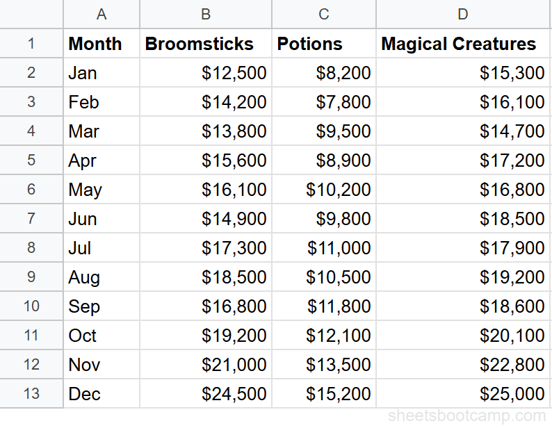
We’ll use the monthly sales summary data with 12 months of revenue across three categories: Broomsticks, Potions, and Magical Creatures.
Sample Data
The table has Month in column A, Broomsticks in column B, Potions in column C, and Magical Creatures in column D, with 12 rows of monthly data.
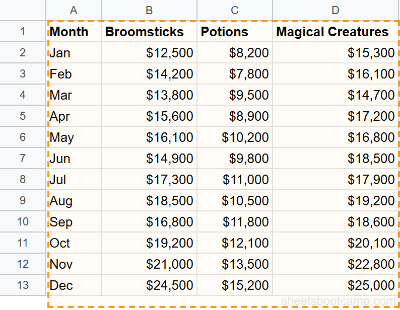
Select your data
Highlight cells A1:D13. This includes the header row (Month, Broomsticks, Potions, Magical Creatures) and all 12 months of data. Google Sheets uses the headers as series labels and the first column as category labels.
Insert a chart
Go to Insert > Chart. Google Sheets creates a chart and opens the Chart Editor sidebar. By default, Sheets may create a column chart (vertical bars). That is fine — you will change it in the next step.
Change to bar chart
In the Chart Editor Setup tab, click the Chart type dropdown. Select Bar chart (under the Bar section). The chart rotates so bars run horizontally, with months listed on the vertical axis.
If you want vertical bars instead, select Column chart from the same dropdown. The data and setup stay the same.
Customize the chart
Switch to the Customize tab in the Chart Editor. Here you can:
- Chart title: Add “Monthly Sales by Category” under Chart & axis titles
- Axis titles: Label the horizontal axis “Revenue ($)” and the vertical axis “Month”
- Legend: Move the legend to the top or bottom for a cleaner layout
- Series colors: Click each series under the Series section and pick a color
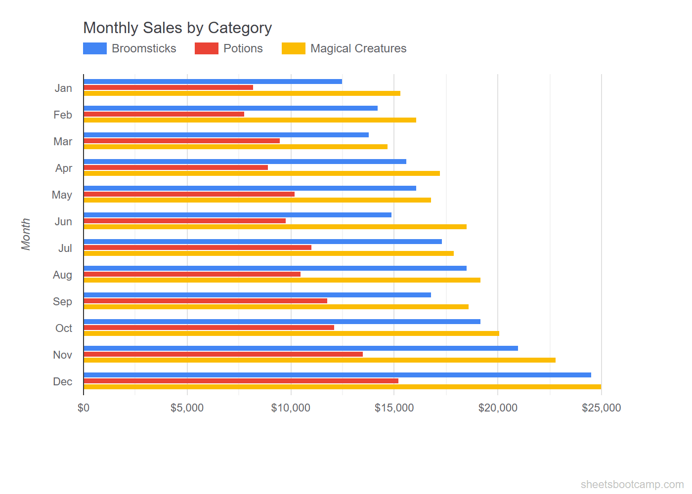
The chart now shows a grouped bar chart with three colored bars per month, one for each product category. December has the tallest bars: $24,500 for Broomsticks, $15,200 for Potions, and $25,000 for Magical Creatures.
Grouped vs Stacked Bar Charts
A grouped bar chart places bars side by side for each category. This is best for comparing individual series values.
A stacked bar chart combines all series into a single bar per category. Each segment represents one series. This is best for comparing totals while still seeing the composition.
To switch between grouped and stacked:
- Double-click the chart to open the Chart Editor
- In the Setup tab, click the Chart type dropdown
- Select Stacked bar chart instead of Bar chart
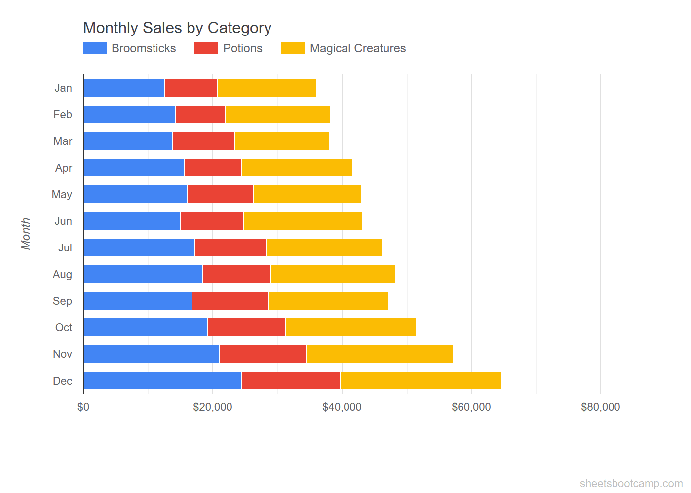
In the stacked view, the total bar length represents Total revenue for each month. December’s bar is the longest at $64,700 total. You can see at a glance that Magical Creatures (the rightmost segment) grew the most from January to December.
Google Sheets also offers a 100% stacked bar chart. This normalizes every bar to the same length and shows each series as a percentage of the total. Use it when the comparison is about proportions, not absolute values.
Customize Your Bar Chart
Double-click any chart to open the Chart Editor. The Customize tab has several sections:
Chart Title and Subtitles
Under Chart & axis titles, you can set:
- Chart title — appears at the top of the chart
- Chart subtitle — smaller text below the title
- Horizontal axis title — labels the value axis
- Vertical axis title — labels the category axis
Series Colors
Under Series, select a data series from the dropdown and change its color. For a bar chart with three categories, set each one to a distinct color that is easy to tell apart.
Data Labels
Under Series, check Data labels to display the exact value on each bar. This is useful when precision matters more than visual comparison. Keep data labels off when the chart has many bars — they get crowded.
Gridlines and Ticks
Under Gridlines and ticks, you can adjust how many gridlines appear on the horizontal axis. Fewer gridlines make the chart cleaner. Remove minor gridlines unless you need fine-grained reading.
Bar charts in Google Sheets always place the first data row at the bottom of the vertical axis. If you want January at the top and December at the bottom, reverse your data order in the source table before creating the chart.
Tips and Best Practices
-
Start the value axis at zero. Google Sheets does this by default for bar charts, but double-check under Customize > Horizontal axis. A non-zero baseline distorts the visual comparison.
-
Limit the number of series. Grouped bar charts with more than 4 series become difficult to read. If you have 5+ categories, consider a stacked bar chart or split into separate charts.
-
Sort categories by value when ranking. If the purpose of the chart is to show a ranking (e.g., top products by revenue), sort your source data from highest to lowest before creating the chart.
-
Use consistent colors across related charts. If Broomsticks is blue in the bar chart, keep it blue in the line chart and pie chart too. This makes a dashboard easier to read.
-
Add a chart title that answers a question. “Monthly Sales by Category” is more informative than “Chart 1.” A good title tells the reader what comparison the chart is making.
Related Google Sheets Tutorials
- Google Sheets Charts: The Complete Guide — Overview of all chart types, SPARKLINE formulas, and customization basics
- How to Make a Line Chart — Show trends over time with line charts
- How to Make a Pie Chart — Display proportions and category breakdowns
- Conditional Formatting Guide — Add color-coded visual cues directly in cells
Frequently Asked Questions
How do I make a bar chart in Google Sheets?
Select your data range including headers, go to Insert > Chart, and Google Sheets creates a chart. If it does not default to a bar chart, open the Chart Editor and select Bar chart from the Chart type dropdown.
What is the difference between a bar chart and a column chart?
A bar chart displays bars horizontally, with categories on the vertical axis. A column chart displays bars vertically, with categories on the horizontal axis. Google Sheets calls horizontal bars a Bar chart and vertical bars a Column chart.
How do I change a bar chart from grouped to stacked?
Double-click the chart to open the Chart Editor. In the Setup tab, change the chart type from Bar chart to Stacked bar chart. Each bar then shows all categories combined into a single bar, divided into colored segments.
Can I change the colors of individual bars?
Yes. Double-click the chart, go to the Customize tab, and expand Series. Select the data series you want to change and pick a new color. You can set a different color for each series in a grouped or stacked chart.
When should I use a bar chart instead of a line chart?
Use a bar chart to compare values across categories, like sales by product or revenue by region. Use a line chart to show trends over time. If your horizontal axis is time-based and you want to see a trend, a line chart is the better choice.