How to Make a Combo Chart in Google Sheets
Learn how to make a combo chart in Google Sheets step by step. Combine columns and lines in one chart to compare category breakdowns with overall trends.
Sheets Bootcamp
April 8, 2026
A combo chart in Google Sheets combines two chart types in a single view, typically columns and a line. This lets you compare category breakdowns alongside a total or trend without switching between separate charts. This guide covers how to build a combo chart from scratch, switch series types, add a second axis, and customize the result.
In This Guide
- When to Use a Combo Chart
- How to Make a Combo Chart: Step-by-Step
- Stacked Columns with a Trend Line
- Customize Your Combo Chart
- Tips and Best Practices
- Related Google Sheets Tutorials
- Frequently Asked Questions
When to Use a Combo Chart
Combo charts answer the question “how do the parts relate to the whole?” They work best when:
- Your series represent different things. Columns show individual category values (Broomsticks, Potions, Magical Creatures) while a line shows the Total or a Target. The different chart types make the distinction visual.
- You want to overlay a trend on category data. A line drawn across the top of grouped columns shows the overall direction without cluttering the category comparison.
- Two series have different scales. Revenue in dollars (columns) and a percentage target (line) can each use their own axis. A combo chart with dual axes keeps both readable.
If all your series represent the same type of measurement at the same scale, a standard column chart or line chart is the better choice.
How to Make a Combo Chart: Step-by-Step
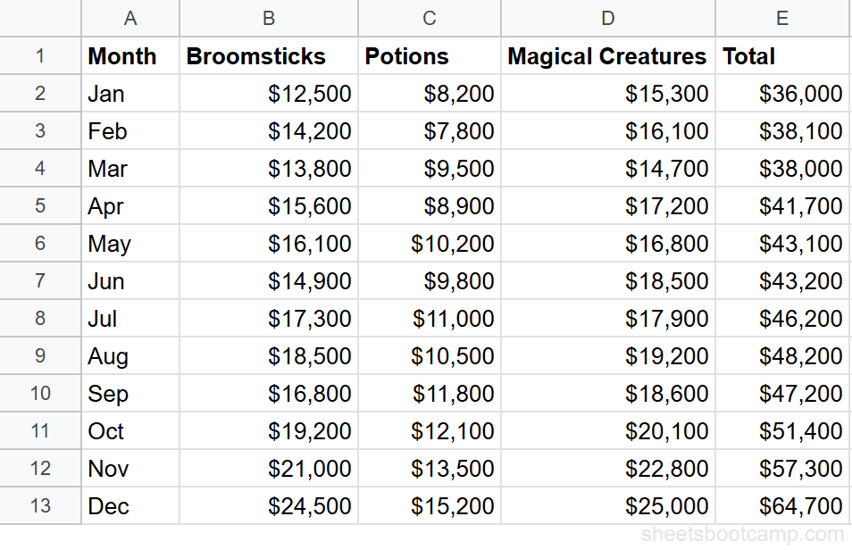
We’ll use the monthly sales summary data with 12 months of revenue across three product categories plus a Total column.
Sample Data
The table has Month in column A, Broomsticks in column B, Potions in column C, Magical Creatures in column D, and Total in column E, with 12 rows of monthly data.
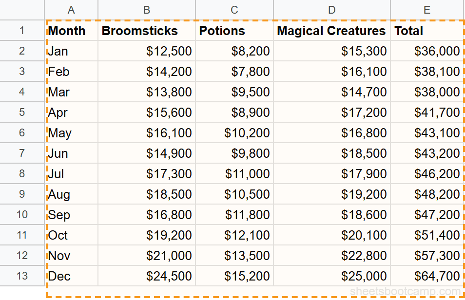
Select your data range
Highlight cells A1:E13. This includes the header row (Month, Broomsticks, Potions, Magical Creatures, Total) and all 12 months. Google Sheets uses the headers as series labels and the Month column as the horizontal axis.
Insert a chart
Go to Insert > Chart. Google Sheets creates a chart and opens the Chart Editor sidebar. It may default to a column chart with all five series as vertical bars. In the Setup tab, click the Chart type dropdown and select Combo chart.
Google Sheets sometimes auto-detects a combo layout when one series has significantly larger values than the others. If it does, the Total series may already appear as a line.
Set the line series
In the Chart Editor Customize tab, expand the Series section. Select Total from the series dropdown. Change its Type from Column to Line. The Total now appears as a line running across the top of the grouped columns, connecting each month’s total revenue.
Customize the chart
Stay in the Customize tab to finish the chart:
- Chart title: Add “Monthly Sales by Category with Total” under Chart & axis titles
- Vertical axis title: “Revenue ($)”
- Horizontal axis title: “Month”
- Legend: Move to the top so it does not overlap the columns or line
- Line weight: Under Series, select Total and increase the line thickness to 3px so it stands out
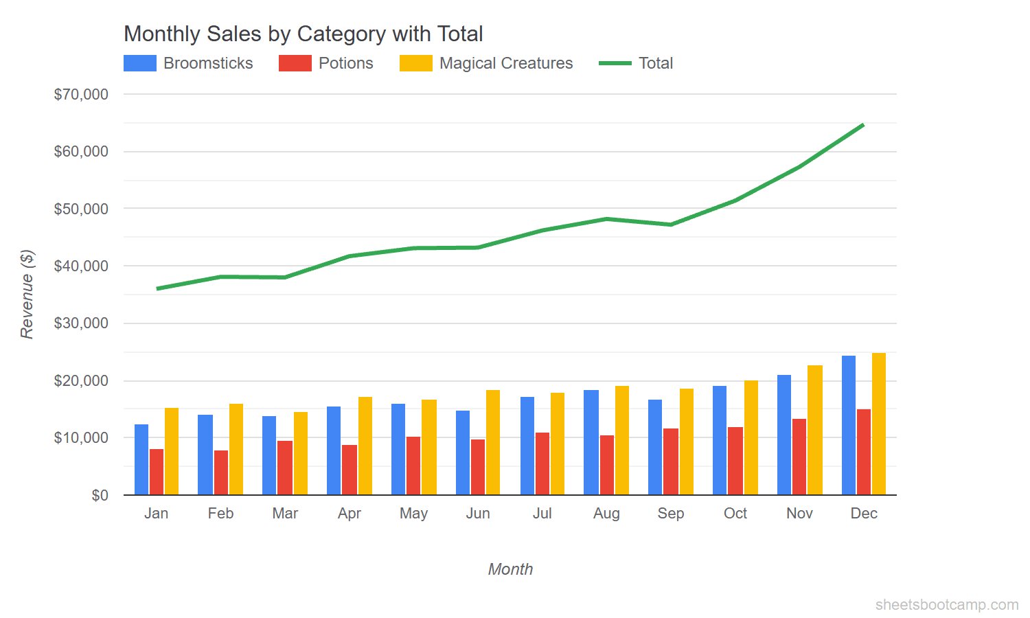
The chart now shows three colored columns per month for Broomsticks, Potions, and Magical Creatures, with the Total line connecting across the top. December has the highest values: $24,500 for Broomsticks, $15,200 for Potions, $25,000 for Magical Creatures, and a Total of $64,700.
Stacked Columns with a Trend Line
A variation on the standard combo chart uses stacked columns with a line overlay. Stacked columns merge the category bars into a single bar per month, showing total height and composition at the same time. The line then represents a separate metric, like a Target.
To create this variant:
- Double-click the chart to open the Chart Editor
- In the Setup tab, change the data range to A1:F13 to include the Target column (F)
- Change the chart type to Combo chart if not already set
- In Customize > Series, set Broomsticks, Potions, and Magical Creatures to Stacked Column (check the Stacking option under Chart & axis titles and select Standard)
- Set the Target series type to Line
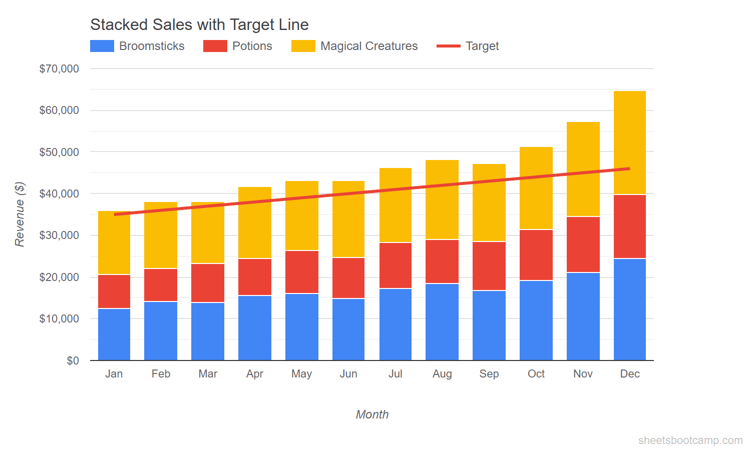
The stacked bars show each month’s combined revenue, broken into category segments. The Target line runs across the chart at a steady incline from $35,000 in January to $46,000 in December. You can see the actual total pulling ahead of the target starting around April.
When using stacked columns with a combo chart, keep the line series separate from the stacking. If Target gets stacked into the columns by mistake, select it under Series in the Customize tab and set its type to Line.
Customize Your Combo Chart
Series Types
Each series in a combo chart can use a different chart type. In Customize > Series, select any series and choose from:
- Column — vertical bars (default for most series)
- Line — connecting line between data points
- Area — filled area below the line
Mixing columns and lines is the most common pattern. Columns for category values, a line for totals or targets.
Dual Axes
When a line series operates on a different scale than the columns, put it on a separate axis:
- Go to Customize > Series
- Select the line series (e.g., Target)
- Change Axis to Right axis
Google Sheets adds a second vertical axis on the right side. The columns read against the left axis and the line reads against the right. This is useful when comparing revenue (thousands) against a metric like growth rate (percentage).
Dual axes can mislead readers if the scales are not clearly labeled. Always add axis titles when using a right axis so readers know which scale applies to which series.
Legend and Colors
Under Customize > Legend, choose a position that does not overlap the chart area. Top works well for combo charts because the columns and line occupy most of the vertical space.
Under Series, set each series to a distinct color. Use solid, saturated colors for columns and a darker or contrasting color for the line. This makes the line visible against the column fill.
Data Labels
Enable data labels on the line series to show exact values at each point. Under Series, select the line and check Data labels. For columns, data labels often create clutter in a combo chart. Add them only if precision matters more than readability.
Tips and Best Practices
-
Limit columns to 3-4 series. More than four grouped columns per month makes the chart cramped. If you have many categories, use stacked columns instead of grouped.
-
Make the line visually distinct. Increase line thickness to 3px and choose a color that contrasts with the column fills. A thin line at the default weight can disappear behind the columns.
-
Use the right chart for the right data. Columns work for discrete category values. Lines work for continuous trends or targets. Do not assign a line type to a category series or a column type to a trend.
-
Label both axes when using dual axes. Two unlabeled vertical axes confuse readers. Add axis titles under Chart & axis titles in the Customize tab.
-
Start the vertical axis at zero. A non-zero baseline exaggerates differences between columns. Check the minimum value under Customize > Vertical axis.
Related Google Sheets Tutorials
- Google Sheets Charts: The Complete Guide — Overview of all chart types, SPARKLINE formulas, and customization basics
- How to Make a Bar Chart — Compare values across categories with horizontal bars
- How to Make a Line Chart — Show trends over time with line charts
- Format and Customize Charts — Colors, titles, axes, and styling for any chart type
Frequently Asked Questions
How do I make a combo chart in Google Sheets?
Select your data range, go to Insert > Chart, and choose Combo chart from the Chart type dropdown in the Chart Editor. Google Sheets plots the first series as columns by default. Change individual series to lines in the Customize > Series section.
Can I mix bars and lines in the same chart?
Yes. A combo chart lets you assign each data series a different chart type. In the Chart Editor Customize tab, expand Series, select the series you want to change, and switch it from Column to Line or vice versa.
When should I use a combo chart instead of separate charts?
Use a combo chart when your data series share the same categories (like months) but represent different things, such as category revenue (columns) vs a total or target (line). The overlay makes comparison easier than reading two separate charts.
How do I add a second axis to a combo chart?
In the Chart Editor Customize tab, expand Series and select the series that needs a different scale. Check the Right axis option. Google Sheets adds a second vertical axis on the right side of the chart.
What data works best for a combo chart?
Combo charts work best when you have two types of data that share the same categories. A common pattern is category breakdowns as columns with a total or target as a line. Avoid mixing more than 4-5 series, as the chart becomes difficult to read.