Format and Customize Charts in Google Sheets
Learn how to format charts in Google Sheets. Covers titles, colors, legends, gridlines, data labels, and fonts to make your charts clear and professional.
Sheets Bootcamp
April 14, 2026
Formatting a chart in Google Sheets turns a default, auto-generated visual into something that communicates clearly and looks professional. The Chart Editor’s Customize tab controls titles, colors, legends, gridlines, data labels, and fonts. This guide walks through each section so you can customize any chart type with confidence.
In This Guide
- How to Customize a Chart: Step-by-Step
- Chart Titles and Axis Labels
- Series Colors
- Legend Position and Style
- Gridlines and Ticks
- Data Labels
- Tips and Best Practices
- Related Google Sheets Tutorials
- Frequently Asked Questions
How to Customize a Chart: Step-by-Step
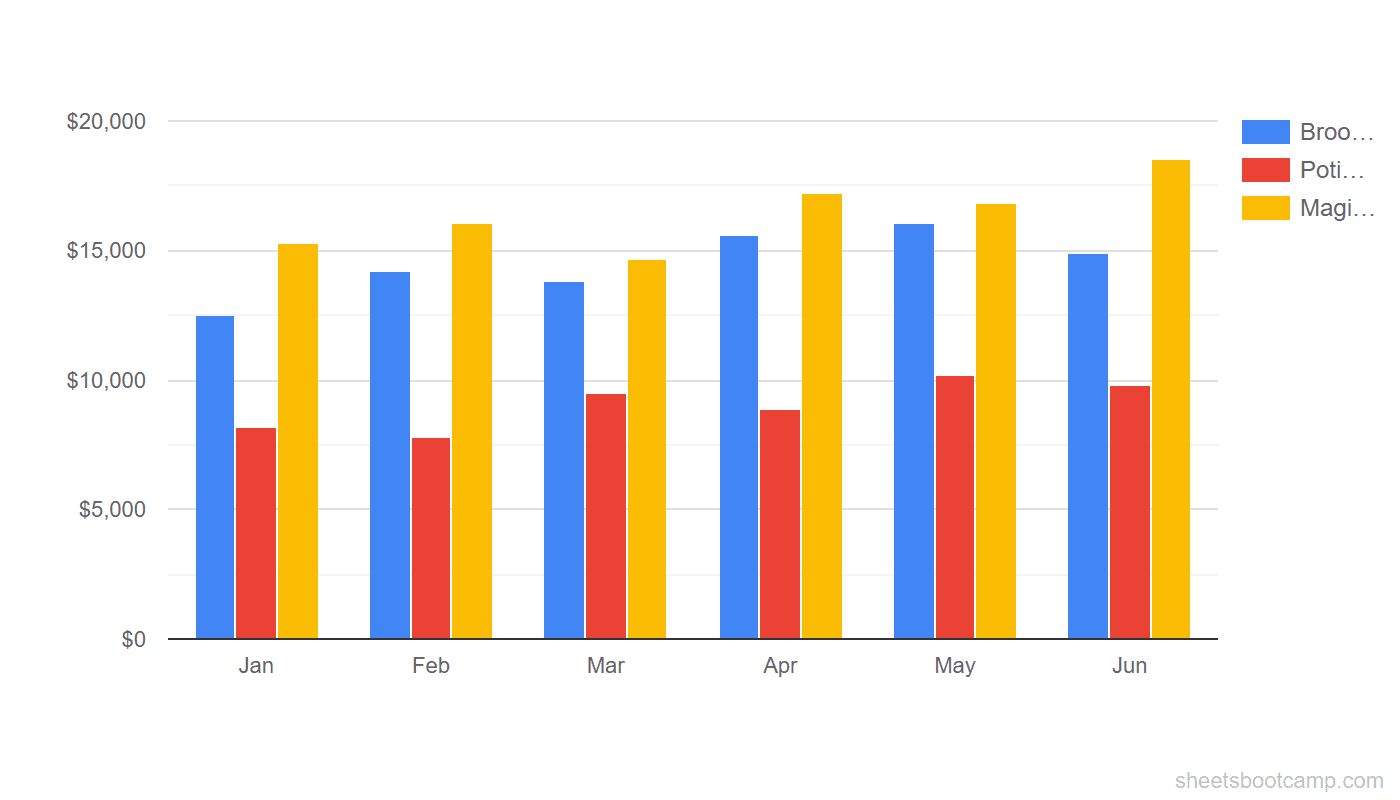
We’ll start with a default column chart built from the monthly summary data (12 months of Broomsticks, Potions, and Magical Creatures revenue), then apply formatting changes one at a time.
Default Chart
Google Sheets creates a chart with automatic titles, default colors, and a right-side legend. It works, but it does not tell the reader much.
Open the Chart Editor
Double-click the chart. The Chart Editor sidebar opens on the right. Switch to the Customize tab at the top of the sidebar. This tab is organized into expandable sections: Chart style, Chart and axis titles, Series, Legend, Horizontal axis, Vertical axis, and Gridlines and ticks.
Add titles and axis labels
Expand Chart and axis titles. Use the dropdown to set each one:
- Chart title: “Monthly Revenue by Category”
- Horizontal axis title: “Month”
- Vertical axis title: “Revenue ($)”
You can also add a subtitle. Set it to a smaller font size so it does not compete with the main title.
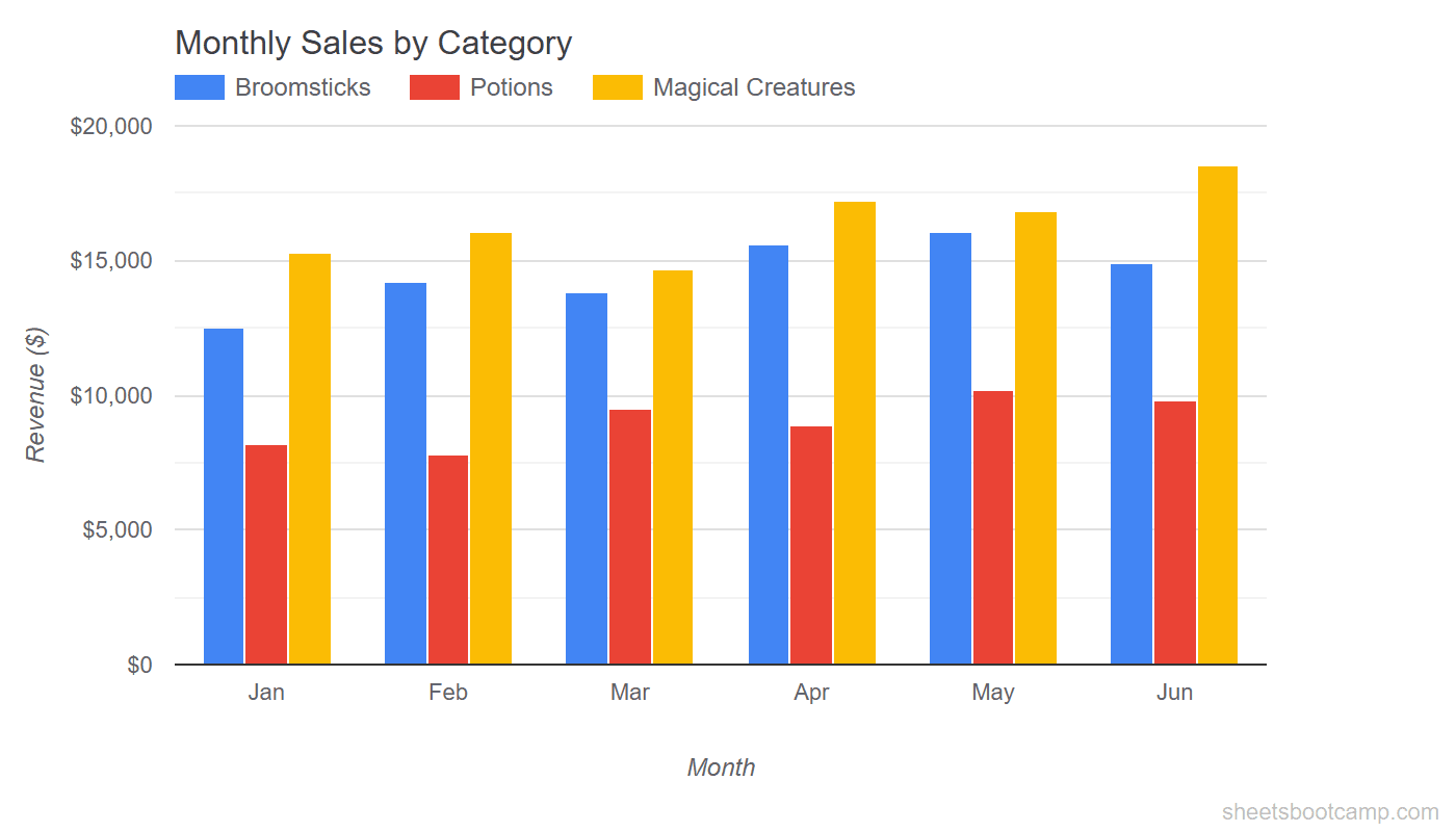
A good chart title states the comparison the chart makes. “Monthly Revenue by Category” is more useful than “Chart 1” or “Sales Data.”
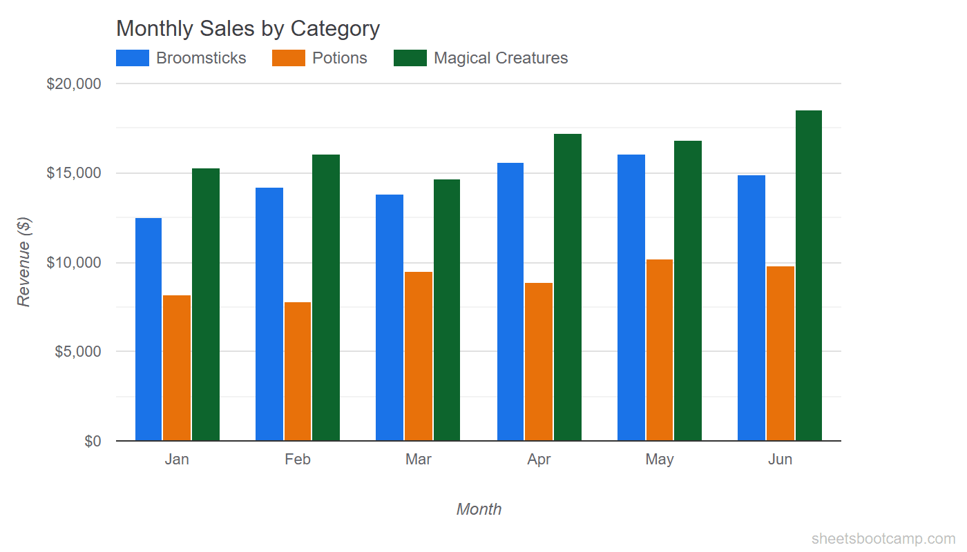
Change series colors
Expand Series. Use the dropdown at the top to select each data series. Click the color swatch next to the series name and pick a new color.
Choose colors that are distinct from each other. Avoid red and green together — about 8% of men have red-green color blindness. Pair colors with different levels of brightness so the series are distinguishable even in grayscale.
Polish the layout
Finish by adjusting the supporting elements:
- Legend: Move to the top under Customize > Legend > Position
- Gridlines: Reduce to major gridlines only under Gridlines and ticks
- Chart style: Uncheck the chart border for a cleaner look
- Font: Set the title to bold, 14pt. Set axis labels to 11pt.
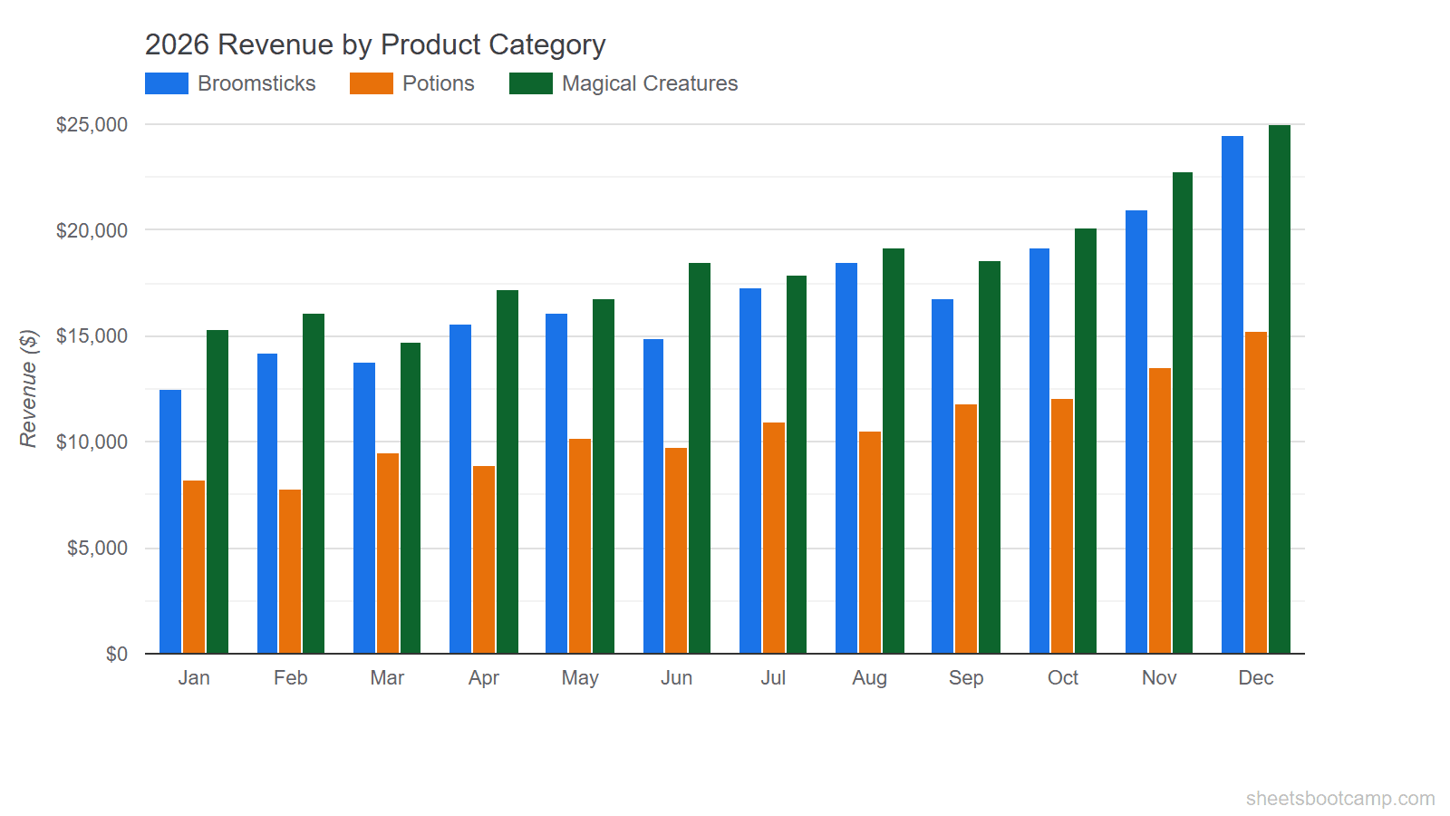
The same data, presented with clear context. The title tells the reader what comparison to look for, the colors are easy to distinguish, and the layout does not distract from the data.
Chart Titles and Axis Labels
The Chart and axis titles section controls four elements:
- Chart title — the main heading at the top of the chart
- Chart subtitle — smaller text below the title
- Horizontal axis title — labels the x-axis (categories or time periods)
- Vertical axis title — labels the y-axis (values)
For each title, you can set the font family, font size, text color, and alignment. Keep the chart title at 14-16pt and axis titles at 10-12pt so they stay readable without dominating the chart.
If the chart title or axis labels do not appear, check that the title text field is not empty. Google Sheets hides the title element entirely when the text is blank.
When to Use a Subtitle
Subtitles add context that the title alone cannot convey. Use them to specify the time period (“Jan-Dec 2026”), the data source (“From Q4 Sales Report”), or the unit of measurement. Skip the subtitle if the title and axis labels already make things clear.
Series Colors
Each data series in a chart gets its own color. Google Sheets assigns defaults from a built-in palette, but those defaults may not match your needs.
To change a series color:
- Double-click the chart
- Go to Customize > Series
- Select the series from the dropdown
- Click the color swatch and pick a color
Color Accessibility
Not everyone sees color the same way. When choosing series colors:
- Use high contrast between series. Blue and orange work well together. Blue and light blue do not.
- Avoid red and green as the only distinction. Pair them with different brightness levels or add data labels.
- Test in grayscale. If you print the chart in black and white, the series should still be distinguishable.
Brand Consistency
If you create multiple charts for a report or dashboard, keep the same color for the same data series across all charts. If Broomsticks is blue in the bar chart, keep it blue in the line chart and any other chart. This helps readers track categories without re-reading the legend each time.
Legend Position and Style
The legend identifies which color belongs to which data series. Under Customize > Legend, the Position dropdown offers:
- Top — horizontal legend above the chart area
- Bottom — horizontal legend below the chart
- Left or Right — vertical legend beside the chart
- Inside — overlaid on the chart area
- None — no legend displayed
Top and Bottom work best for most charts. They keep the chart area wide and avoid squeezing the data. Right is the default, but it narrows the chart area on smaller screens.
Choose None when the chart has only one data series (the legend adds no information) or when you add data labels that already identify each element.
You can also adjust the legend’s font family, font size, and text color. Keep the legend font size the same as the axis labels for visual consistency.
Gridlines and Ticks
Gridlines help the reader estimate values. Too many gridlines create visual noise. Too few make the chart hard to read.
Under Customize > Gridlines and ticks, you control:
- Major gridlines — the primary reference lines (usually 4-6 across the axis)
- Minor gridlines — finer lines between the major ones
- Major ticks and Minor ticks — small marks on the axis itself
For most charts, keep major gridlines and remove everything else. Set the major gridline count to 4 or 5. This gives the reader enough reference points without cluttering the chart.
To remove gridlines entirely, set the count to None. This works well for charts where exact values are less important than the overall trend or comparison, or when you use data labels instead.
Removing all gridlines and ticks while also hiding data labels makes the chart hard to interpret. Keep at least one reference system — gridlines or data labels — so the reader can estimate values.
Data Labels
Data labels display the exact value on each bar, point, or slice. They remove the need for the reader to estimate values from the axis.
To add data labels:
- Go to Customize > Series
- Select the series
- Check Data labels
You can set the label position (inside, outside, center) and adjust the font size. For bar charts and column charts, outside places the label above the bar. For pie charts, labels appear on or near each slice.
When to Use Data Labels
- Presentations and reports where exact numbers matter more than visual trends
- Charts with few data points where labels do not overlap
- Pie charts where percentage labels clarify the slice proportions
When to Skip Data Labels
- Line charts with many data points — labels on every point create a wall of text
- Dense bar charts — 12 months with 3 series means 36 labels, which gets crowded fast
- Trend-focused charts where the direction matters more than the exact value
If labels overlap, reduce the font size or switch to showing labels on only the first and last data points.
Tips and Best Practices
-
Format after the data is final. Changing the data range or chart type resets some formatting. Build the chart structure first, then customize.
-
Use the Chart style section for quick wins. The Chart style section (at the top of the Customize tab) has options for background color, chart border, font, and a Maximize toggle that fills the chart area. Start here before adjusting individual elements.
-
Keep fonts consistent. Use one font family across the title, axis labels, legend, and data labels. Mixing fonts makes the chart look unpolished.
-
Right-click the chart and select Copy chart to reuse formatting. If you create a second chart from similar data, copy the formatted chart, then update its data range. This preserves all your color, legend, and title settings.
-
Check the chart at its final display size. A chart that looks good filling your screen may be unreadable when embedded in a small dashboard cell. Zoom out or resize the chart to match its destination before finalizing.
Related Google Sheets Tutorials
- Google Sheets Charts: The Complete Guide — Overview of all chart types, creation steps, and customization basics
- How to Make a Bar Chart — Create grouped and stacked bar charts from scratch
- How to Make a Line Chart — Show trends over time with single and multi-series line charts
- How to Make a Pie Chart — Display proportions with pie and donut charts
Frequently Asked Questions
How do I change chart colors in Google Sheets?
Double-click the chart, go to the Customize tab, and expand Series. Select a data series from the dropdown and click the color swatch to pick a new color. Repeat for each series. Changes apply immediately.
How do I add a title to a chart in Google Sheets?
Double-click the chart, go to Customize > Chart and axis titles. Select Chart title from the dropdown, type your title, and adjust the font, size, and color. You can also set axis titles and a subtitle from the same section.
How do I change the legend position?
Double-click the chart, go to Customize > Legend. Use the Position dropdown to move the legend to Top, Bottom, Left, Right, Inside, or None. Top or bottom works best for most charts.
Can I add data labels to show exact values on a chart?
Yes. In the Customize tab, expand Series, select the series, and check Data labels. Each bar, point, or slice displays its value. Adjust the font size if labels overlap.
How do I remove gridlines from a chart?
Double-click the chart, go to Customize > Gridlines and ticks. Set the count to None or reduce the number of gridlines. You can remove major gridlines, minor gridlines, or both to create a cleaner look.