How to Make a Line Chart in Google Sheets
Learn how to make a line chart in Google Sheets step by step. Covers single and multiple series, trendlines, dual axes, and formatting for clear trends.
Sheets Bootcamp
March 16, 2026
A line chart in Google Sheets connects data points with lines to show how values change over time. Line charts are the default choice for tracking trends — revenue over months, traffic over weeks, or scores over assignments. This guide covers how to create a line chart, add multiple series, use trendlines, and format the result for clear reading.
In This Guide
- When to Use a Line Chart
- How to Make a Line Chart: Step-by-Step
- Multiple Series on One Chart
- Add a Trendline
- Customize Your Line Chart
- Tips and Best Practices
- Related Google Sheets Tutorials
- Frequently Asked Questions
When to Use a Line Chart
Line charts answer the question “how did this change over time?” They work best when:
- The horizontal axis is sequential. Months, dates, quarters, years, or any ordered series.
- You want to show direction. The slope of the line shows whether values are rising, falling, or flat.
- You are comparing trends. Two or more lines on the same chart let you see if trends move together or diverge.
If the horizontal axis is not time-based or ordered (like product names, regions, or departments), a bar chart is the better choice.
How to Make a Line Chart: Step-by-Step
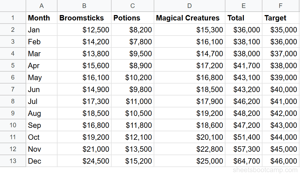
We’ll use the monthly sales summary data. The table has 12 months with a Total column (E) and a Target column (F).
Sample Data
The monthly summary has Month in column A, three category columns (B through D), Total in column E, and Target in column F.
Select your data
For a line chart comparing Actual vs Target revenue, you need columns A (Month), E (Total), and F (Target). These columns are not adjacent, so hold Ctrl (Cmd on Mac) while selecting:
- Click and drag to select A1:A13 (Month column with header)
- Hold Ctrl and click and drag E1:F13 (Total and Target columns with headers)
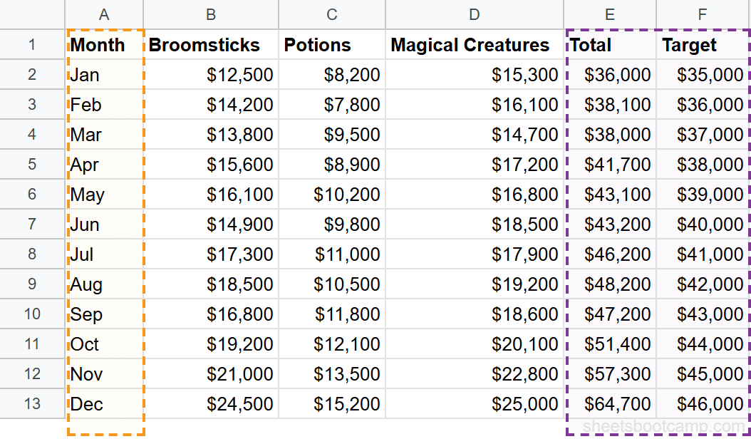
If your columns are adjacent, a single selection works. Non-adjacent selection with Ctrl is only needed when you want to skip columns in the middle.
Insert a chart
Go to Insert > Chart. Google Sheets analyzes the selected data and creates a chart. If it defaults to a column chart, open the Chart Editor sidebar and change the chart type.
Set the chart type to Line
In the Chart Editor Setup tab, click the Chart type dropdown and select Line chart. The chart now shows two lines — one for Total revenue and one for Target — plotted against months on the horizontal axis.
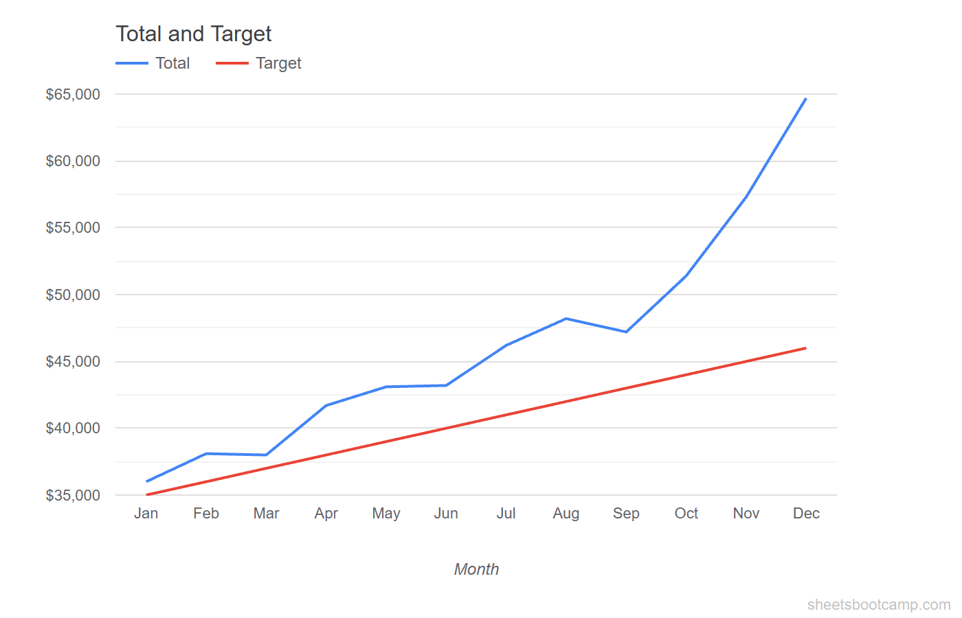
Customize the chart
Switch to the Customize tab:
- Chart title: “Actual vs Target Revenue”
- Horizontal axis title: “Month”
- Vertical axis title: “Revenue ($)”
- Legend: Move to the top so it does not overlap the lines
The chart shows Total revenue starting at $36,000 in January and climbing to $64,700 in December. The Target line rises steadily from $35,000 to $46,000. The gap between actual and target widens over the year.
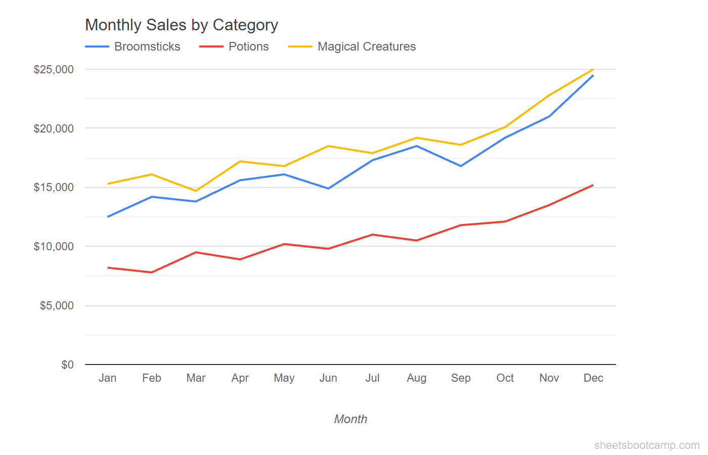
Multiple Series on One Chart
A single line chart can display multiple data series. Each series gets its own line with a distinct color.
To add a new series to an existing chart:
- Double-click the chart to open the Chart Editor
- In the Setup tab, click Add Series
- Select the column range for the new series
You can also expand the data range. For example, changing the range from A1:A13, E1:F13 to A1:D13 would plot separate lines for Broomsticks, Potions, and Magical Creatures instead of the totals.
More than 4 lines on a single chart becomes hard to read. If you have many series, consider grouping related ones or creating separate charts.
Add a Trendline
A trendline overlays a best-fit line on your data to show the overall direction, smoothing out short-term fluctuations.
To add a trendline:
- Double-click the chart
- Go to Customize > Series
- Select the series (e.g., Total)
- Check the Trendline box
- Choose a type: Linear, Exponential, Polynomial, or Moving average
Linear works for data that increases or decreases at a roughly steady rate. The monthly sales data has a clear upward trend, so a linear trendline shows the general growth direction.
Moving average smooths out the line by averaging a set number of data points. Use a period of 3 for quarterly smoothing on monthly data.
Trendlines are visual overlays. They do not add data to your spreadsheet. To calculate trend values in cells, use the TREND or FORECAST functions.
Customize Your Line Chart
Line Style
Under Customize > Series, you can change:
- Line thickness — thicker lines stand out more but can overlap. 2-3px works well for most charts.
- Point shape — add circles, squares, or diamonds at each data point. Useful for charts with fewer data points.
- Dashed lines — set a line to dashed to visually separate it from solid lines. Good for targets or forecasts.
Axis Formatting
Under Customize > Horizontal axis and Vertical axis:
- Min and max values — set custom bounds on the vertical axis to zoom in on a specific range
- Number format — display values as currency, percentages, or plain numbers
- Label font size — reduce font size if axis labels overlap
Dual Axes
When two series have very different scales (e.g., revenue in thousands and conversion rate as a percentage), put them on separate axes:
- Go to Customize > Series
- Select the series with a different scale
- Change Axis from Left axis to Right axis
This adds a second vertical axis on the right side of the chart. Each line reads against its own scale.
Tips and Best Practices
-
Always include zero on the vertical axis. A truncated axis exaggerates small changes and misleads the reader. Check under Customize > Vertical axis that the minimum is 0.
-
Use data labels sparingly. Labeling every point on a 12-month chart creates clutter. Add data labels only to the first and last point, or to specific points you want to call out.
-
Use a dashed line for targets or forecasts. Visual distinction between actual data and projected data helps the reader interpret the chart correctly.
-
Keep the chart title specific. “Revenue Trend” is vague. “Monthly Revenue vs Target, Jan–Dec 2026” tells the reader exactly what they are looking at.
-
Consider date functions for time axes. If your dates are stored as text, Google Sheets may not space them correctly on the axis. Convert text dates to real date values for accurate axis scaling.
Related Google Sheets Tutorials
- Google Sheets Charts: The Complete Guide — Overview of all chart types with creation and customization basics
- How to Make a Bar Chart — Compare values across categories with horizontal bars
- How to Make a Pie Chart — Show proportions and category breakdowns in a circle chart
- Date Functions Guide — Work with dates for time-based chart axes
Frequently Asked Questions
How do I make a line chart in Google Sheets?
Select your data range including headers, then go to Insert > Chart. If Google Sheets does not create a line chart by default, open the Chart Editor and select Line chart from the Chart type dropdown.
How do I add a trendline to a line chart?
Double-click the chart, go to the Customize tab, and expand the Series section. Select the data series, then check the Trendline box. Choose linear, exponential, polynomial, or moving average depending on your data pattern.
How do I chart non-adjacent columns in Google Sheets?
Hold Ctrl (Cmd on Mac) while selecting each column range. For example, click and drag A1:A13, then hold Ctrl and click and drag E1:E13. Insert the chart with both ranges selected. Google Sheets combines them.
Can I have two Y-axes on a line chart?
Yes. Double-click the chart, go to Customize > Series, select the series you want on the right axis, and change Axis to Right axis. This adds a second vertical axis for that series.
When should I use a line chart instead of a bar chart?
Use a line chart when the horizontal axis represents time (days, months, years) and you want to show how values change over that period. The connecting lines make trends and direction visible. Use a bar chart for comparing distinct categories.