How to Make a Pie Chart in Google Sheets
Learn how to make a pie chart in Google Sheets step by step. Covers basic pies, donut charts, percentage labels, exploded slices, and when to avoid pie charts.
Sheets Bootcamp
March 17, 2026
A pie chart in Google Sheets shows how parts make up a whole. Each slice represents a category’s share of the total, making pie charts ideal for showing composition at a glance — revenue by product, expenses by department, or traffic by source. This guide walks through creating a pie chart, adding percentage labels, using donut charts, and knowing when a pie chart is the wrong choice.
In This Guide
- When to Use a Pie Chart
- How to Make a Pie Chart: Step-by-Step
- Add Percentage Labels
- Donut Charts
- Customize Your Pie Chart
- When Not to Use a Pie Chart
- Tips and Best Practices
- Related Google Sheets Tutorials
- Frequently Asked Questions
When to Use a Pie Chart
Pie charts answer the question “what percentage does each category contribute to the total?” They work best when:
- You have 3 to 5 categories. Fewer slices are easier to compare visually.
- The slices are different enough to see. Two slices at 48% and 52% are hard to distinguish. 20%, 35%, and 45% are clear.
- You want to show composition, not comparison. If the goal is to compare values across categories, a bar chart gives a more accurate visual comparison.
How to Make a Pie Chart: Step-by-Step
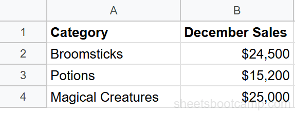
We’ll create a pie chart showing December revenue by product category from the monthly summary data. The three categories are Broomsticks ($24,500), Potions ($15,200), and Magical Creatures ($25,000).
Sample Data
For a pie chart, you need two columns: one for labels and one for values. We’ll set up a small table with the December data extracted from the monthly summary.
Prepare your data
Pie charts need exactly two columns: a label column and a value column. The label column contains category names and the value column contains numbers. Set up a small table:
| Category | December Sales |
|---|---|
| Broomsticks | $24,500 |
| Potions | $15,200 |
| Magical Creatures | $25,000 |
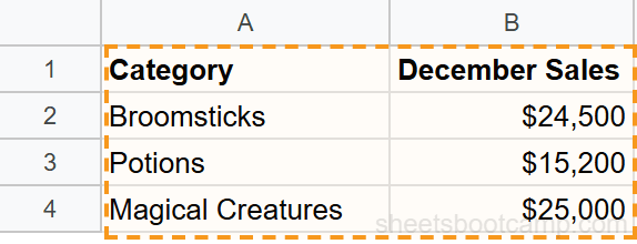
Select the data
Highlight both columns including the header row. Select cells A1:B4 (header plus 3 data rows).
Insert a chart
Go to Insert > Chart. Google Sheets analyzes the data and may create a pie chart automatically since it detects a label-value pair. If it defaults to a different chart type, open the Chart Editor and select Pie chart from the Chart type dropdown.
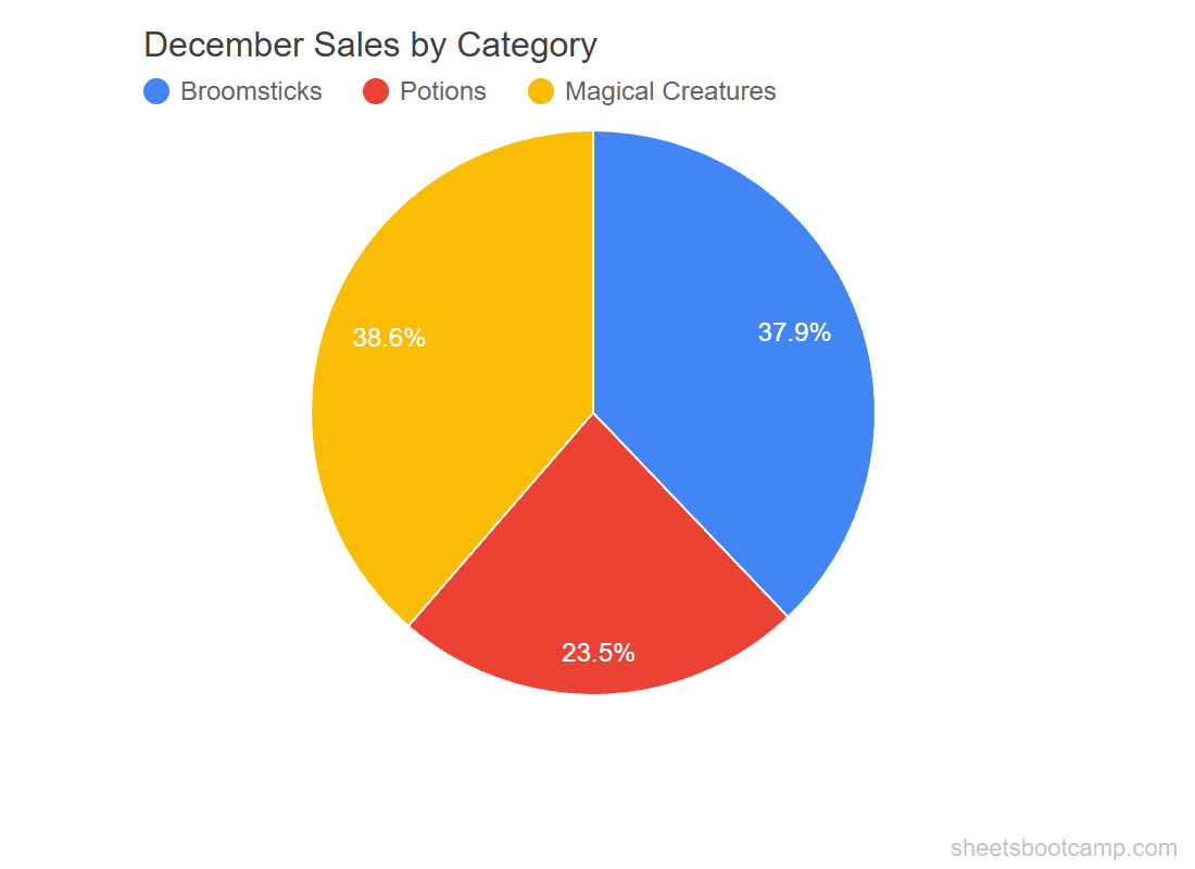
The chart shows three slices. Magical Creatures takes the largest slice ($25,000 of the $64,700 total), followed by Broomsticks ($24,500), with Potions as the smallest slice ($15,200).
Add percentage labels
Double-click the chart and go to Customize > Pie chart. Set the Slice label dropdown to Percentage. Each slice now displays its share:
- Magical Creatures: 38.6%
- Broomsticks: 37.9%
- Potions: 23.5%
You can also set Slice label to Value to show dollar amounts, or Value and percentage to show both. Choose whichever format helps the reader most.
Add Percentage Labels
By default, pie charts in Google Sheets show the legend but not the values on each slice. To add labels:
- Double-click the chart
- Go to Customize > Pie chart
- Set Slice label to one of:
- Percentage — shows each slice’s share of the total
- Value — shows the raw number
- Value and percentage — shows both
- Label — shows the category name on each slice
Percentage labels are the most common choice because pie charts are designed to show proportions.
Donut Charts
A donut chart is a pie chart with a hollow center. The data representation is identical — each arc represents a slice’s proportion. The center space can hold a total, a label, or it can remain empty for a cleaner look.
To create a donut chart:
- Create a regular pie chart using the steps above
- Open the Chart Editor
- Change the chart type from Pie chart to Donut chart
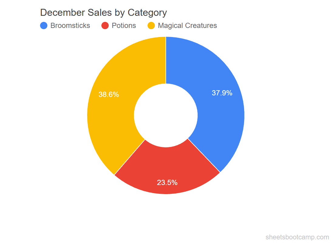
Under Customize > Pie chart, the Donut hole slider controls the size of the center hole. A larger hole emphasizes the arcs; a smaller hole looks closer to a traditional pie.
Google Sheets does not natively support adding text to the donut center. To display a total in the center, you can overlay a text box manually using the Drawing tool, but this does not update automatically when data changes.
Customize Your Pie Chart
Slice Colors
Under Customize > Pie chart, click any slice in the chart or select it from the list. Pick a color for each category. Use distinct, high-contrast colors so slices are easy to tell apart.
Legend Position
Under Customize > Legend, move the legend to the right, bottom, top, or inside the chart. For pie charts with few slices, labels on the slices themselves (via Slice label) can replace the legend entirely.
3D Pie Chart
Google Sheets offers a 3D pie chart option. Under Setup > Chart type, select 3D Pie chart. This adds a perspective effect.
3D pie charts distort the visual comparison between slices. The slices closest to the viewer appear larger than they actually are. Use the flat (2D) pie chart for accurate representation.
Exploded Slices
To pull a slice away from the center for emphasis:
- Double-click the chart to enter edit mode
- Click once on the pie to select all slices
- Click again on the specific slice you want to separate
- Drag it outward
You can also set the distance under Customize > Pie chart > Slice by entering a Distance from center value.
When Not to Use a Pie Chart
Pie charts have well-known limitations. Avoid them when:
- You have more than 5 categories. Small slices become slivers that are impossible to compare. Group small categories into an “Other” slice, or use a bar chart instead.
- Slices are close in size. Humans are poor at comparing angles. If two categories are 31% and 33%, a pie chart makes them look identical. A bar chart shows the 2% difference clearly.
- You need to compare across time periods. Two pie charts side by side (January vs December) are harder to read than a single line chart or grouped bar chart.
- The data does not represent parts of a whole. If the values do not sum to a meaningful total, a pie chart is misleading.
Tips and Best Practices
-
Keep it to 3–5 slices. If you have more categories, combine the smallest ones into “Other” to keep the chart readable.
-
Start the largest slice at 12 o’clock. Google Sheets starts slices from the top by default, which is the standard convention. If the order looks wrong, sort your data from largest to smallest.
-
Use percentage labels, not raw values. Pie charts are about proportions. Showing $24,500 does not communicate “38% of total” as clearly as showing the percentage directly.
-
Avoid 3D effects. They look polished but distort the data. Stick with flat 2D pie charts for accuracy.
-
Consider a donut chart for dashboards. The clean center space gives a modern look and reduces visual clutter when the chart is one of several on a page.
Related Google Sheets Tutorials
- Google Sheets Charts: The Complete Guide — All chart types, SPARKLINE formulas, and customization basics
- How to Make a Bar Chart — Compare values across categories with horizontal bars
- How to Make a Line Chart — Track trends and changes over time
- Conditional Formatting Guide — Add color-coded visual cues directly in your data cells
Frequently Asked Questions
How do I make a pie chart in Google Sheets?
Select a data range with one column of labels and one column of values, then go to Insert > Chart. If Google Sheets does not create a pie chart by default, open the Chart Editor and select Pie chart from the Chart type dropdown.
How do I show percentages on a pie chart?
Double-click the chart, go to the Customize tab, and expand Pie chart. Check the Slice label dropdown and select Percentage. Each slice then displays its share of the total as a percentage.
What is the difference between a pie chart and a donut chart?
A donut chart is a pie chart with a hole in the center. The data and setup are identical. The center space can be used to display a total or label. In the Chart Editor, select Donut chart instead of Pie chart.
How many slices should a pie chart have?
Keep pie charts to 3 to 5 slices. More than 5 slices makes the chart hard to read because the smaller slices become nearly invisible. If you have more than 5 categories, group the smallest ones into an Other slice or use a bar chart instead.
Can I explode a slice out of a pie chart?
Yes. Double-click the chart, then click directly on the slice you want to separate. Drag it outward to pull it away from the center. This draws attention to that category. You can also set the distance under Customize > Pie chart > Slice.