How to Make a Scatter Plot in Google Sheets
Learn how to make a scatter plot in Google Sheets step by step. Covers data setup, trendlines, formatting, and when scatter charts work best.
Sheets Bootcamp
April 7, 2026
A scatter plot in Google Sheets displays individual data points on a grid to reveal the relationship between two numeric variables. Unlike bar charts or line charts, scatter plots do not connect or group data points. Each dot sits at the intersection of its two values, making patterns like correlations, clusters, and outliers visible at a glance. This guide covers how to build a scatter plot, add a trendline, and format the chart for clear communication.
In This Guide
- When to Use a Scatter Plot
- How to Make a Scatter Plot: Step-by-Step
- Add a Trendline
- Customize Your Scatter Plot
- Tips and Best Practices
- Related Google Sheets Tutorials
- Frequently Asked Questions
When to Use a Scatter Plot
Scatter plots answer the question “is there a relationship between these two variables?” They work best when:
- Both axes are numeric. Scatter plots require numbers on both the horizontal and vertical axes. Categories like product names or regions belong in a bar chart.
- You want to spot correlations. If units sold goes up and revenue goes up with it, the dots trend upward from left to right. That is a positive correlation.
- You need to find outliers. Points that fall far from the main cluster stand out immediately on a scatter plot. A table of 18 rows does not make outliers nearly as obvious.
If one axis represents time (months, weeks, dates), a line chart is the better choice. Line charts connect points in sequence to show trends over time. Scatter plots treat every point independently.
How to Make a Scatter Plot: Step-by-Step
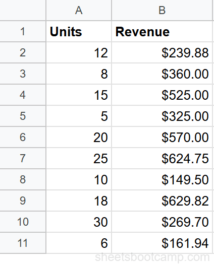
We’ll use the sales records data. The two columns we need are Units (ranging from 5 to 30) and Revenue (ranging from $199 to $625) across 18 transactions. The goal is to see whether more units sold leads to higher revenue.
Sample Data
The table has Units in one column and Revenue in the next, with 18 rows of transaction data and a header row.
Prepare two numeric columns
Set up your data with Units in the first column and Revenue in the second. The first column becomes the horizontal axis (X) and the second becomes the vertical axis (Y). Include headers — Google Sheets uses them as axis labels.
The independent variable (the one you think drives the other) goes in the first column. Here, units sold drives revenue, so Units is the X-axis and Revenue is the Y-axis.
Select your data and insert a chart
Highlight both columns including the header row. With 18 rows of data plus headers, select the full range covering Units and Revenue.
Go to Insert > Chart. Google Sheets analyzes the data and creates a chart. If it defaults to a line chart or column chart, open the Chart Editor sidebar and change the chart type.
In the Chart Editor Setup tab, click the Chart type dropdown and select Scatter chart. The chart now shows 18 individual dots plotted on the grid, with Units on the horizontal axis and Revenue on the vertical axis.
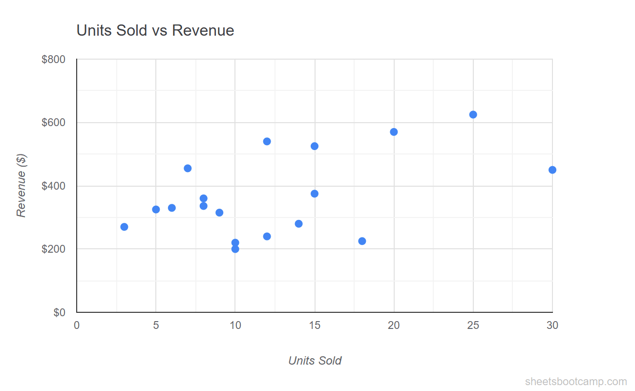
The dots trend upward from left to right. Transactions with more units sold generally have higher revenue. A few points sit above or below the main cluster — those are worth investigating in your source data.
Add a trendline
A trendline fits a line through the scatter plot to show the overall direction of the data. To add one:
- Double-click the chart to open the Chart Editor
- Go to Customize > Series
- Check the Trendline box
- Select Linear for a straight-line fit
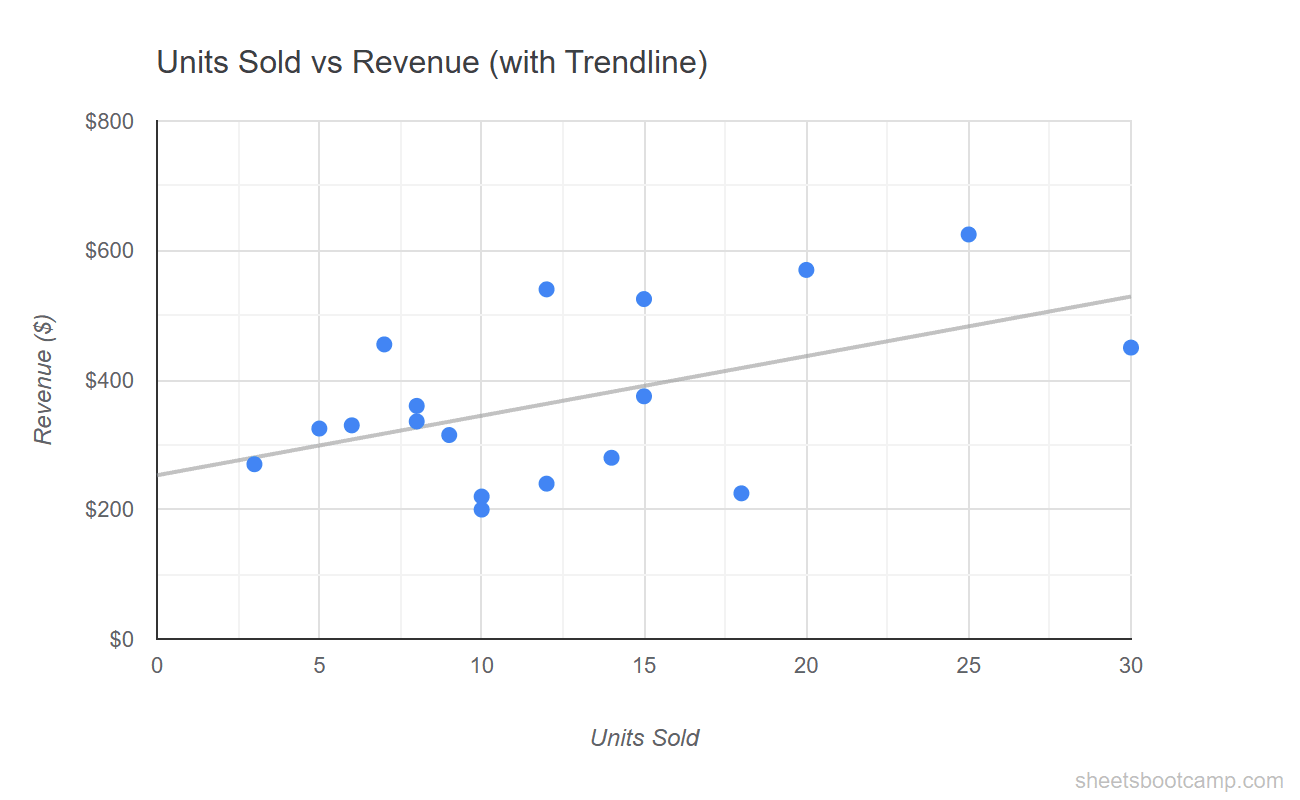
The linear trendline slopes upward, confirming the positive correlation between units sold and revenue. Points above the line earned more revenue than the trend predicts; points below earned less.
Customize the chart
Switch to the Customize tab in the Chart Editor:
- Chart title: Add “Units Sold vs Revenue” under Chart & axis titles
- Horizontal axis title: “Units Sold”
- Vertical axis title: “Revenue ($)”
- Point size: Increase to 7-8px under Series for better visibility
- Point color: Pick a color with strong contrast against the white background
Unlike line and bar charts, scatter plots do not have a legend by default since there is only one data series. If you add multiple series later, the legend appears automatically.
Add a Trendline
Trendlines help quantify the relationship between two variables. Google Sheets offers several types:
- Linear — a straight line. Use when the relationship is steady and proportional. Most common choice.
- Exponential — a curved line that rises or falls faster over time. Use when growth accelerates.
- Polynomial — a line that curves one or more times. Set the degree (2 for a parabola, 3 for an S-curve). Use when the data has peaks and valleys.
- Logarithmic — a curve that rises quickly then flattens. Use when values increase fast at first then level off.
- Moving average — smooths the data by averaging nearby points. Set the period (e.g., 3 or 5 points).
To show the R-squared value (how well the trendline fits the data), check Show R squared under the Trendline options. An R-squared of 0.85 means the trendline explains 85% of the variation in the data. Closer to 1.0 is a stronger fit.
A trendline does not prove causation. Two variables can correlate strongly without one causing the other. The trendline shows the pattern in the data — interpreting why requires context beyond the chart.
Customize Your Scatter Plot
Point Size and Shape
Under Customize > Series, adjust:
- Point size — the default is small. Increase to 7-10px for presentations or dashboards. Decrease for dense datasets where points overlap.
- Point shape — choose circles (default), squares, diamonds, triangles, or stars. Useful when plotting multiple series on the same chart to distinguish them without relying on color alone.
Axis Formatting
Under Customize > Horizontal axis and Vertical axis:
- Min and max values — set custom bounds to zoom into a specific range. For example, set the vertical axis minimum to $100 and maximum to $700 to focus on the revenue range.
- Number format — display the vertical axis as currency or the horizontal axis as plain numbers.
- Gridlines — reduce gridline count for a cleaner look, or add minor gridlines for precise reading.
Data Labels
Under Customize > Series, check Data labels to display values next to each point. For scatter plots with many points, data labels create clutter. Use them only when you have 10 or fewer points, or when specific points need callouts.
Multiple Series
To plot two relationships on the same scatter chart, add a third column of numeric data to your selection. Google Sheets creates a second set of points in a different color. Each series gets its own entry in the legend and can have its own trendline.
Tips and Best Practices
-
Put the independent variable on the X-axis. The variable you control or that drives the outcome goes on the horizontal axis. The outcome (dependent variable) goes on the vertical axis. This follows the convention readers expect.
-
Use a trendline to quantify the relationship. The dots show the pattern; the trendline puts a line through it. Add the R-squared value so readers know how strong the correlation is.
-
Watch for outliers. Points far from the main cluster may be data entry errors or genuine exceptions. Investigate them before drawing conclusions from the chart.
-
Avoid connecting the dots. If you find yourself wanting to draw lines between the points, you probably need a line chart instead. Scatter plots show relationships between variables, not sequences.
-
Keep the aspect ratio close to square. A scatter plot stretched wide or tall distorts the visual relationship. Aim for a chart that is roughly as wide as it is tall so the slope of the trendline reads accurately.
Related Google Sheets Tutorials
- Google Sheets Charts: The Complete Guide — Overview of all chart types, SPARKLINE formulas, and customization basics
- How to Make a Line Chart — Track trends and changes over time with connected data points
- How to Make a Bar Chart — Compare values across categories with horizontal bars
- Conditional Formatting Guide — Add color-coded visual cues directly in your data cells
Frequently Asked Questions
How do I make a scatter plot in Google Sheets?
Select two columns of numeric data (like Units and Revenue), go to Insert > Chart, and change the chart type to Scatter chart in the Chart Editor. Google Sheets plots the first column on the horizontal axis and the second on the vertical axis.
What is the difference between a scatter plot and a line chart?
A scatter plot shows individual data points without connecting them, revealing the relationship between two numeric variables. A line chart connects data points in order, showing trends over time. Use a scatter plot for correlations and a line chart for time series.
How do I add a trendline to a scatter plot?
Double-click the chart, go to Customize > Series, and check the Trendline box. Choose linear, exponential, polynomial, logarithmic, or moving average. The trendline shows the general direction of the data.
Can I label individual points in a scatter plot?
Yes. In the Chart Editor Customize tab, expand Series and check Data labels. Each point displays its value. For custom labels, add a third column with label text and set it as the label in the chart data range.
When should I use a scatter plot instead of a bar chart?
Use a scatter plot when you want to show the relationship between two numeric variables, like units sold vs revenue. Use a bar chart when you want to compare values across categories. Scatter plots reveal correlations; bar charts compare magnitudes.