SPARKLINE in Google Sheets: Mini Charts in Cells
Learn how to use SPARKLINE in Google Sheets to create mini line, bar, column, and winloss charts inside cells. Syntax, options, and examples.
Sheets Bootcamp
April 9, 2026
SPARKLINE in Google Sheets creates a miniature chart inside a single cell. Unlike standard charts that float over the sheet, SPARKLINE is a formula. You type it into a cell, point it at a data range, and it draws a tiny line, bar, column, or winloss chart right where the formula lives. This guide covers the syntax, all four chart types, and the options that control colors and scale.
In This Guide
- SPARKLINE Syntax
- How to Create a SPARKLINE: Step-by-Step
- SPARKLINE Chart Types
- Customize Colors and Options
- Tips and Best Practices
- Related Google Sheets Tutorials
- Frequently Asked Questions
SPARKLINE Syntax
SPARKLINE takes two arguments: the data and an optional set of options.
=SPARKLINE(data, [options])| Argument | Description | Required |
|---|---|---|
| data | The range of values to chart. Can be a single row or column of numbers. | Yes |
| options | A set of key-value pairs that control chart type, colors, and scale. Written as a curly-brace array. | No |
Without options, SPARKLINE draws a default line chart. To set options, pass them as a two-column array inside curly braces. Separate key-value pairs with commas, and separate pairs from each other with semicolons.
=SPARKLINE(B2:G2, {"charttype","column";"color","#4285f4"})Option keys and string values must be wrapped in double quotes inside the curly braces. Semicolons separate each key-value pair. Commas separate the key from its value. Mixing these up breaks the formula.
How to Create a SPARKLINE: Step-by-Step
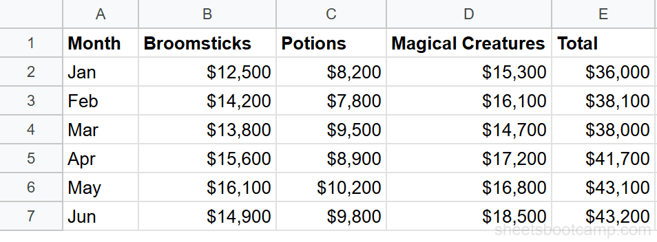
We’ll use a monthly summary table with six months of revenue data across columns B through G. Each row represents a product category, and the SPARKLINE goes in column H.
Sample Data
The table has Category in column A, six months of revenue in columns B through G (Jan to Jun), and an empty Trend column in H where sparklines will go.
Set up your data
Arrange your data so numeric values run across a row or down a column. In this example, months are in columns B through G and each row holds one category’s revenue. Column H is where the sparkline will appear.
Enter the basic SPARKLINE formula
Select cell H2 and enter:
=SPARKLINE(B2:G2)A tiny line chart appears in cell H2. It plots the six values from January through June, showing the trend for that row. The cell displays the chart instead of a number.
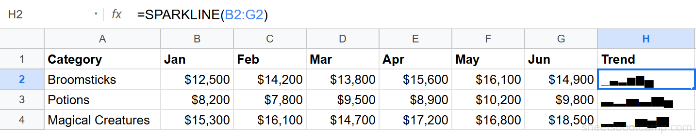
Copy the formula down column H to add sparklines for every row. The cell references adjust automatically, so each row gets its own mini chart.
Choose a chart type
To switch from a line to a different chart type, add an options argument. For example, to create a horizontal bar chart:
=SPARKLINE(B2:D2, {"charttype","bar";"max",50000})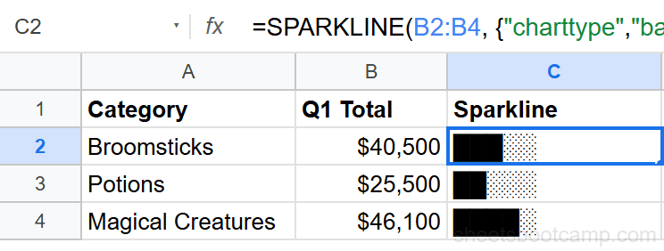
The four chart types are line, bar, column, and winloss. We’ll cover each one in the next section.
Customize with options
Add more key-value pairs separated by semicolons to control color, line width, and axis bounds:
=SPARKLINE(B2:G2, {"charttype","line";"color","#4285f4";"linewidth",2})This draws a blue line chart with a 2-pixel line. You can combine as many options as the chart type supports.
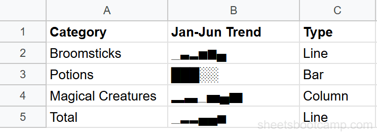
SPARKLINE Chart Types
Line (Default)
The line type connects data points with a continuous line. It is the default when you omit the options argument.
=SPARKLINE(B2:G2)Use line sparklines to show trends across time, like monthly revenue or weekly signups. The slope of the line tells you whether values are rising, falling, or flat.
Bar
The bar type draws a horizontal stacked bar. Each value in the range becomes a colored segment of the bar.
=SPARKLINE(B2:D2, {"charttype","bar";"max",25000})Bar sparklines work well for showing composition, like how three categories contribute to a total. Set the max option so bars across different rows share the same scale.
Column
The column type draws vertical bars for each data point. Think of it as a tiny column chart inside the cell.
=SPARKLINE(B2:G2, {"charttype","column";"color","#34a853"})Column sparklines are useful when you want to compare individual values rather than see a continuous trend. Each bar stands on its own, making highs and lows easy to spot.
Winloss
The winloss type shows positive values as blocks above the midline, negative values as blocks below it, and zeros as gaps.
=SPARKLINE(B2:G2, {"charttype","winloss";"negcolor","red";"color","green"})Winloss sparklines work for data that represents gains and losses, like profit/loss by month or game results. The chart does not show magnitude, only direction.
Customize Colors and Options
Each chart type supports a different set of options. Here are the most useful ones.
Line Options
| Option | Description | Example Value |
|---|---|---|
| color | Line color | "#4285f4" or "blue" |
| linewidth | Line thickness in pixels | 2 |
| highcolor | Color of the highest point marker | "green" |
| lowcolor | Color of the lowest point marker | "red" |
| firstcolor | Color of the first point marker | "orange" |
| lastcolor | Color of the last point marker | "purple" |
| empty | How to handle empty cells: "zero" or "ignore" | "zero" |
To highlight the high and low points on a line sparkline:
=SPARKLINE(B2:G2, {"color","#4285f4";"highcolor","green";"lowcolor","red";"linewidth",2})Bar Options
| Option | Description | Example Value |
|---|---|---|
| max | Maximum value for scaling the bar | 50000 |
| color1 | Color of the first segment | "#4285f4" |
| color2 | Color of the second segment | "#ea4335" |
| empty | How to handle empty cells | "zero" |
Column Options
| Option | Description | Example Value |
|---|---|---|
| color | Color of positive value columns | "#34a853" |
| negcolor | Color of negative value columns | "red" |
| axis | Show or hide the axis line | true |
| axiscolor | Color of the axis line | "gray" |
| ymin | Minimum value for the vertical scale | 0 |
| ymax | Maximum value for the vertical scale | 5000 |
| empty | How to handle empty cells | "zero" |
Winloss Options
| Option | Description | Example Value |
|---|---|---|
| color | Color of positive blocks | "green" |
| negcolor | Color of negative blocks | "red" |
| axis | Show or hide the axis line | true |
| axiscolor | Color of the axis line | "gray" |
| empty | How to handle empty cells | "zero" |
Color values can be color names like "blue" or hex codes like "#4285f4". Hex codes give you more control over the exact shade. Wrap all string values in double quotes inside the options array.
Tips and Best Practices
-
Set consistent scales across rows. If you have sparklines for multiple rows, use
yminandymax(column type) ormax(bar type) so the charts share the same scale. Without this, a row with small values looks the same as a row with large values. -
Use line sparklines for trend, column for comparison. A line chart emphasizes direction over time. A column chart emphasizes individual data points. Pick the type that matches what the reader needs to see.
-
Keep the data range short. Sparklines are tiny. More than 12-15 data points compresses the chart to the point where individual values are hard to distinguish. For long time series, consider a full line chart instead.
-
Pair sparklines with conditional formatting. Add color scales or icon sets to the numeric columns alongside the sparkline. The sparkline shows the shape; the conditional formatting highlights specific values.
-
Handle empty cells explicitly. By default, SPARKLINE treats empty cells as gaps. Add
"empty","zero"to the options if you want missing data plotted as zero instead of breaking the line.
Related Google Sheets Tutorials
- Google Sheets Charts: The Complete Guide — Overview of all chart types with creation and customization basics
- How to Make a Line Chart — Show trends over time with full-size line charts
- Dynamic Chart Ranges — Automatically expand chart data ranges as new rows are added
- Conditional Formatting Guide — Add color-coded visual cues directly in cells
Frequently Asked Questions
What is SPARKLINE in Google Sheets?
SPARKLINE is a function that creates a miniature chart inside a single cell. It draws a tiny line, bar, column, or winloss chart from a range of values, showing trends without taking up space on the sheet.
What chart types does SPARKLINE support?
SPARKLINE supports four chart types: line (default), bar (horizontal stacked bar), column (vertical bars), and winloss (shows positive, negative, and zero values as up, down, or empty blocks).
Can I change the color of a SPARKLINE?
Yes. Add options to the formula using the format =SPARKLINE(data, {"color","blue"}). You can set color for the line, lowcolor and highcolor for min/max points, and negcolor for negative values in winloss charts.
How do I make a SPARKLINE bar chart?
Use =SPARKLINE(B2:B4, {"charttype","bar";"max",50000}). Set charttype to bar and define a max value so the bars have a consistent scale. Each value appears as a segment of a horizontal stacked bar.
Does SPARKLINE update automatically when data changes?
Yes. SPARKLINE references a data range, so when values in that range change, the mini chart updates immediately. This makes sparklines useful for dashboards where data refreshes regularly.