How to Add a Trendline in Google Sheets
Learn how to add a trendline in Google Sheets charts. Choose linear, exponential, or polynomial types, display the equation, and show the R-squared value.
Sheets Bootcamp
August 17, 2026
A trendline in Google Sheets is a line overlaid on a chart that reveals the overall direction of your data. Instead of eyeballing whether sales are rising or costs are flat, you add a trendline and let Sheets calculate the best-fit line for you. This guide covers how to add a trendline, the six types available, and how to display the equation and R-squared value on your chart.
In This Guide
- How to Add a Trendline: Step-by-Step
- Trendline Types Explained
- Show the Equation and R-Squared Value
- Customize the Trendline Appearance
- Tips and Best Practices
- Related Google Sheets Tutorials
- Frequently Asked Questions
How to Add a Trendline: Step-by-Step
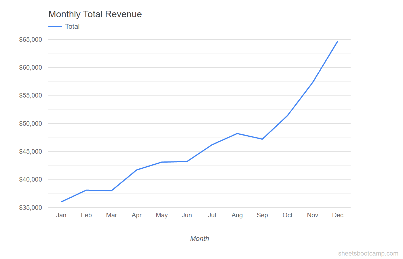
We’ll use a monthly summary table with Total sales from January through December. The values range from $36,000 in January to $64,700 in December, showing a clear upward pattern that a trendline will quantify.
Sample Data
The table has Month in column A and Total in column E. We’ll chart these two columns to create a line chart, then add a trendline.

Create a chart from your data
Select cells A1:A13 and E1:E13 (hold Ctrl to select non-adjacent columns). Go to Insert > Chart. Google Sheets creates a chart from the selected data. If it does not default to a line chart, open the Chart editor and change the Chart type to Line chart under the Setup tab.
Open the Chart editor
Double-click anywhere on the chart. The Chart editor panel opens on the right side of the screen. Click the Customize tab at the top of the panel, then expand the Series section.
Add the trendline
Scroll down inside the Series section until you see the Trendline checkbox. Check the box. A straight line appears on your chart, running through the data points to show the general direction of the trend.
The default trendline type is Linear. You can change it to Exponential, Polynomial, or other types using the Type dropdown that appears after you enable the trendline.
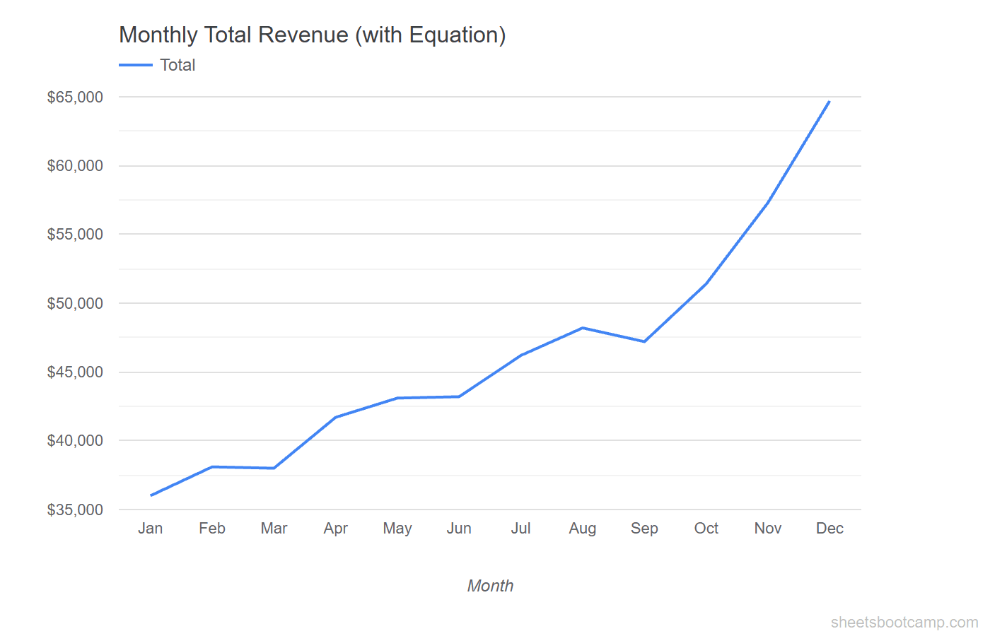
Display the equation and R-squared
With the trendline enabled, two additional checkboxes appear below the Type dropdown: Show equation and Show R-squared. Check both. The trendline equation and R-squared value appear as labels on the chart, letting you see the exact formula Sheets calculated.
Trendline Types Explained
Google Sheets offers six trendline types. Each fits different data patterns. Choosing the right type matters because the wrong trendline misrepresents the trend.
Linear
A straight line that minimizes the distance between itself and all data points. Use linear when your data increases or decreases at a roughly constant rate. This is the most common trendline type and the default in Google Sheets.
Best for: Steady growth or decline, like monthly sales that rise by a consistent amount.
Exponential
A curved line that fits data that rises or falls at an increasing rate. The growth multiplies rather than adds. Use exponential when the rate of change itself is increasing.
Best for: Rapid growth patterns, like compound returns or viral adoption curves.
Exponential trendlines cannot handle zero or negative values in your data. If your dataset includes zeros, the exponential option will produce an error or a misleading fit.
Polynomial
A curved line defined by a polynomial equation. You set the degree (2 through 6), which controls how many bends the line can have. A degree-2 polynomial creates a parabola. Higher degrees produce more curves.
Best for: Data that rises and falls, like seasonal sales or performance that peaks then drops.
Logarithmic
A curved line that rises quickly at first, then levels off. The rate of change decreases as values increase. Use logarithmic when data grows fast early on but slows over time.
Best for: Diminishing returns, like learning curves or initial user adoption.
Power
A curved line based on a power function. Similar to exponential but based on the relationship between the x and y variables raised to a power. Use power trendlines when the data follows a pattern where doubling one variable causes a consistent proportional change in the other.
Best for: Scientific data, physical relationships, or data where both axes are positive.
Moving Average
Not a best-fit line. Instead, it smooths the data by averaging a set number of consecutive data points (the period). A 3-period moving average averages every three consecutive values, producing a smoother line that removes short-term fluctuations.
Best for: Noisy data where you want to see the underlying pattern without sharp spikes.
Show the Equation and R-Squared Value
The trendline equation and R-squared value turn a visual aid into a quantitative tool.
The Trendline Equation
When you check Show equation, Sheets displays the mathematical formula for the trendline directly on the chart. For a linear trendline, the equation follows the format y = mx + b, where m is the slope and b is the y-intercept.
For the monthly sales data, the linear equation might read something like y = 2,590x + 32,460. This tells you that Total sales increase by roughly $2,590 each month, starting from a baseline of about $32,460.
The R-Squared Value
When you check Show R-squared, Sheets displays a number between 0 and 1. This value (written as R-squared) measures how well the trendline fits the data.
| R-Squared Range | Interpretation |
|---|---|
| 0.9 to 1.0 | Strong fit. The trendline closely follows the data. |
| 0.7 to 0.9 | Good fit. The trendline captures most of the pattern. |
| 0.5 to 0.7 | Moderate fit. The trendline shows a general direction but misses some variation. |
| Below 0.5 | Weak fit. The trendline type may not match the data pattern. Try a different type. |
A high R-squared value does not prove causation. It only tells you that the trendline shape matches the data pattern. The underlying cause of the trend is something you determine from context, not from the chart.
Customize the Trendline Appearance
After adding a trendline, you can adjust how it looks on the chart. All options are in the Series section of the Customize tab.
Line color. Click the color swatch next to the Trendline label to pick a different color. Use a color that contrasts with your data line so the trendline stands out.
Line opacity. Adjust the opacity slider to make the trendline more or less transparent. A semi-transparent trendline lets the data points show through clearly.
Line thickness. Change the line weight to make the trendline thicker or thinner. A thinner line works when the trendline is secondary to the data. A thicker line works when the trend is the main message.
Label. You can set a custom label for the trendline that appears in the chart legend. This is useful when your chart has multiple series, each with its own trendline.
Tips and Best Practices
-
Start with linear. Linear trendlines are the most common and the easiest to interpret. Only switch to exponential or polynomial if the linear R-squared value is low and the data clearly follows a curved pattern.
-
Compare R-squared values across types. Add a linear trendline, note the R-squared value, then switch to polynomial (degree 2). If the R-squared improves noticeably, the curved trendline fits your data better. Keep the type with the higher R-squared.
-
Use scatter plots for the best trendline results. Scatter plots treat both axes as numeric values, which gives Sheets the most accurate data to calculate the trendline. Line charts work too, but scatter plots are the standard choice for regression analysis.
-
Avoid high polynomial degrees. A degree-5 or degree-6 polynomial can overfit your data, bending to match every fluctuation instead of showing the real trend. Stick to degree 2 or 3 unless you have a specific reason for a higher degree.
-
Do not extrapolate beyond your data range. A trendline shows patterns within your existing data. Extending the line past December to predict January sales assumes the same pattern continues, which may not be true.
Related Google Sheets Tutorials
- Google Sheets Charts: The Complete Guide — Overview of all chart types with creation and customization basics
- How to Make a Line Chart — Create line charts to show trends over time
- How to Make a Scatter Plot — Build scatter plots for comparing two numeric variables
- Dynamic Chart Ranges — Automatically expand chart data ranges as new rows are added
Frequently Asked Questions
What is a trendline in Google Sheets?
A trendline is a line overlaid on a chart that shows the general direction of your data. Google Sheets calculates the best-fit line based on the trendline type you choose, such as linear, exponential, or polynomial.
Can you add a trendline to a bar chart in Google Sheets?
No. Google Sheets only supports trendlines on line charts, area charts, scatter plots, and column charts. Bar charts, pie charts, and other chart types do not offer the trendline option.
How do I show the trendline equation on a chart?
Double-click the chart to open the Chart editor. Go to Customize > Series, scroll to the Trendline section, and check the Show equation box. The equation appears directly on the chart.
What does the R-squared value mean on a trendline?
The R-squared value measures how closely the trendline fits your data. A value of 1.0 means a perfect fit. A value closer to 0 means the trendline does not explain the variation in your data well.