How to Make a Histogram in Google Sheets
Learn how to make a histogram in Google Sheets to visualize frequency distributions. Step-by-step guide covering bin sizes, customization, and formatting.
Sheets Bootcamp
February 20, 2026 · Updated August 10, 2026
A histogram in Google Sheets groups numeric values into ranges and shows how often values fall within each range. It is the go-to chart for visualizing frequency distributions, whether you are analyzing sales totals, test scores, or response times. This guide walks through creating a histogram chart step by step, adjusting bin sizes, and customizing the result.
In This Guide
- What Is a Histogram?
- How to Create a Histogram: Step-by-Step
- How to Customize Histogram Bins
- Tips and Best Practices
- Related Google Sheets Tutorials
- Frequently Asked Questions
What Is a Histogram?
A histogram chart divides a range of numeric values into equal-width intervals called bins. Each bar represents one bin, and the height of the bar shows how many values fall within that range. Unlike a bar chart, where each bar represents a separate category, histogram bars represent continuous ranges of numbers. The bars touch each other because there are no gaps between the ranges.
Histograms answer the question: “How is my data distributed?” You can see at a glance whether values cluster around a center point, skew toward one end, or spread evenly across the range.
How to Create a Histogram: Step-by-Step
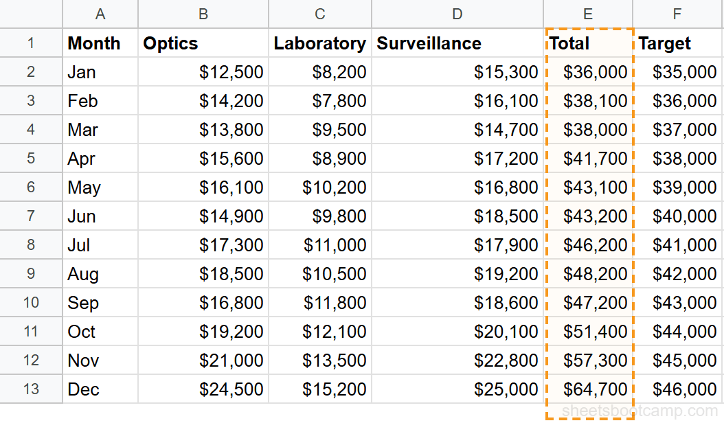
We’ll use a monthly summary table with 12 months of sales data. The Total column contains values from $36,000 to $64,700. The histogram will show how these monthly totals are distributed across different ranges.
Sample Data
The table has Month in column A, three product categories in columns B through D, Total in column E, and Target in column F. We’ll chart the Total column.
Select your data
Select the Total column including the header. In this example, highlight E1:E13. You only need a single column of numeric values for a histogram. The header tells Google Sheets what to label the chart.
Insert a chart
Go to Insert > Chart. Google Sheets analyzes the selected data and creates a chart. It may default to a column chart or line chart. The Chart Editor sidebar opens on the right side of the screen.
Change the chart type to Histogram
In the Chart Editor Setup tab, click the Chart type dropdown. Scroll down and select Histogram chart. The chart redraws with bars that represent frequency ranges instead of individual data points.
Google Sheets does not list Histogram under the Bar or Column sections. Scroll past those sections in the Chart type dropdown to find the Histogram option in its own category labeled “Other.”
Review the histogram
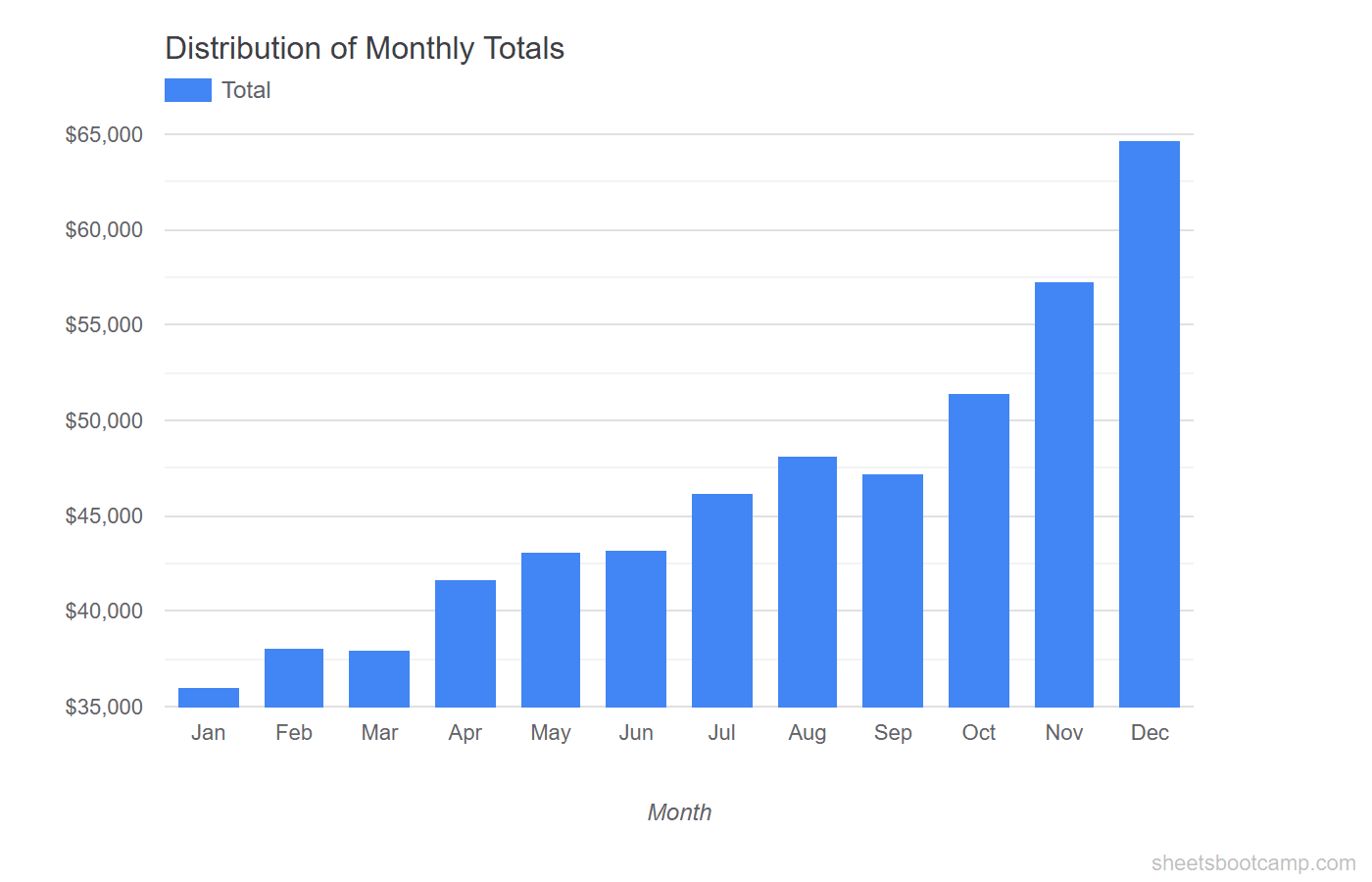
The histogram now shows how the 12 monthly totals are distributed. Each bar covers a range of values, and the bar height indicates how many months fall within that range. Lower totals cluster on the left, and higher totals appear on the right.
How to Customize Histogram Bins
The default bin size works for many datasets, but you can adjust it to reveal more or less detail in the distribution.
Change the Bucket Size
Double-click the chart to open the Chart Editor. Go to the Customize tab and expand the Histogram section. The Bucket size field controls how wide each bin is.
For our monthly totals ($36,000 to $64,700):
- A bucket size of 5000 creates 6 bars. Each bar covers a $5,000 range.
- A bucket size of 10000 creates 3 wider bars, showing a broader grouping.
- A bucket size of 2500 creates more bars with finer detail.

Start with a bucket size that creates 5 to 8 bars. Too few bars hide patterns in the data. Too many bars make the chart noisy and harder to read.
Set Outlier Percentage
The Outlier percentile option in the Histogram section lets you group extreme values into a single bar at either end of the chart. Set this to a small value (like 5) if a few extreme values stretch the chart and compress the rest of the bars.
Show Item Dividers
Enable Show item dividers in the Histogram section to add thin lines inside each bar. Each line represents an individual data point within that bin. This is helpful when bins contain only a few values and you want to see exactly how many.
Tips and Best Practices
-
Use a single column of numbers. Histograms work on one set of numeric values. If you need to compare two distributions, select two columns and Google Sheets overlays them with different colors.
-
Remove currency formatting from the source data if bins look uneven. Google Sheets handles formatted numbers correctly, but raw numbers avoid any edge cases with thousand separators or currency symbols.
-
Adjust the bucket size to match your analysis. For salary data, $10,000 buckets might make sense. For test scores, buckets of 5 or 10 points work better. Match the bin width to the scale and purpose of your data.
-
Add a chart title that describes the distribution. A title like “Distribution of Monthly Sales Totals (2025)” tells the reader what the histogram measures. Set it in the Customize tab under Chart & axis titles.
-
Pair histograms with summary statistics. Show the AVERAGE, MEDIAN, MIN, and MAX values alongside the chart. The histogram shows the shape of the distribution. The statistics provide the exact numbers.
Related Google Sheets Tutorials
- Google Sheets Charts: The Complete Guide — Overview of all chart types with creation and customization basics
- How to Make a Bar Chart — Compare values across categories with horizontal bar charts
- Chart Formatting and Customization — Change colors, labels, legends, and titles on any chart type
- Dynamic Chart Ranges — Automatically expand chart data ranges as new rows are added
Frequently Asked Questions
What is a histogram in Google Sheets?
A histogram is a chart that groups numeric values into ranges called bins and shows how many values fall into each bin. It visualizes the frequency distribution of a dataset, making it easy to see where values cluster and how they spread out.
How do I change the bin size on a histogram?
Double-click the chart to open the Chart Editor. Go to the Customize tab, expand Histogram, and change the Bucket size value. A smaller bucket size creates more bars with narrower ranges. A larger bucket size creates fewer bars with wider ranges.
What is the difference between a histogram and a bar chart?
A histogram groups continuous numeric data into ranges and shows frequency counts. A bar chart compares distinct categories. Histogram bars touch each other because the ranges are continuous. Bar chart bars have gaps because the categories are separate.
Can I make a histogram from multiple columns?
Yes. Select multiple columns of numeric data before inserting the chart. Google Sheets overlays the distributions using different colors, one for each column. This is useful for comparing how two or more datasets are distributed.