
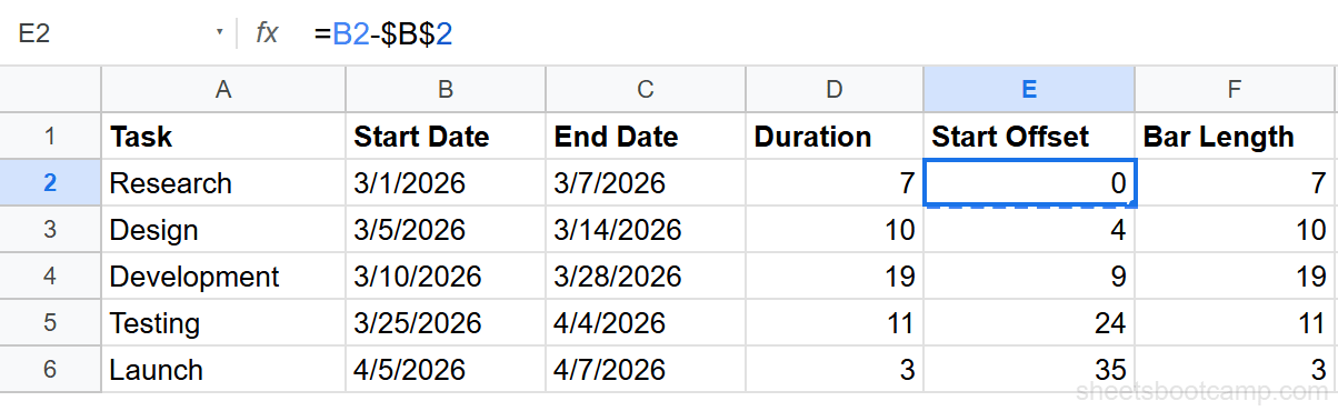
The Start Offset formula uses an absolute reference ($B$2) so every task measures its offset from the same project start date. Without the dollar signs, the reference shifts as you copy the formula down and the offsets will be wrong.
intermediate 7 min read
How to Make a Gantt Chart in Google Sheets
Learn how to make a Gantt chart in Google Sheets using a stacked bar chart. Covers data setup, helper formulas, formatting, and project timeline tips.
SB
Sheets Bootcamp
March 16, 2026 · Updated April 10, 2026
Table of Contents
A Gantt chart in Google Sheets displays project tasks as horizontal bars on a timeline, showing when each task starts and how long it lasts. Google Sheets does not have a built-in Gantt chart type, but you can build one using a stacked bar chart with a hidden offset series. This guide covers the data setup, helper formulas, chart creation, and formatting to turn a standard stacked bar into a project timeline.
In This Guide
- What Is a Gantt Chart
- How to Make a Gantt Chart: Step-by-Step
- How the Stacked Bar Trick Works
- Customize Your Gantt Chart
- Tips and Best Practices
- Related Google Sheets Tutorials
- Frequently Asked Questions
What Is a Gantt Chart
A Gantt chart is a horizontal bar chart where each bar represents a task. The bar’s position shows the start date, and its length shows the duration. Tasks are listed vertically, and time runs along the horizontal axis.
Use a Gantt chart when you need to:
- Visualize a project timeline. See all phases at a glance, from kickoff to launch.
- Identify overlapping tasks. Spot which tasks run in parallel and where bottlenecks may form.
- Communicate schedules to a team. A Gantt chart gives everyone the same view of what happens when.
Dedicated project management tools include Gantt charts by default. In Google Sheets, you build one manually. The tradeoff is more setup, but full control over the data and formatting.
How to Make a Gantt Chart: Step-by-Step
We’ll use a five-phase project schedule with tasks running from March through April 2026.
1
Set up your task data
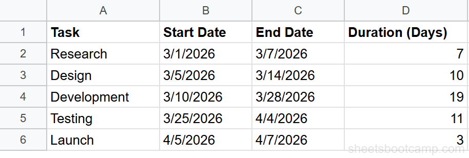
Create a table with four columns: Task (A), Start Date (B), End Date (C), and Duration (D).
Enter the following project phases:
| Task | Start Date | End Date | Duration |
|---|---|---|---|
| Research | 3/2/2026 | 3/13/2026 | 11 |
| Design | 3/10/2026 | 3/24/2026 | 14 |
| Development | 3/20/2026 | 4/10/2026 | 21 |
| Testing | 4/6/2026 | 4/17/2026 | 11 |
| Launch | 4/15/2026 | 4/21/2026 | 6 |
Calculate Duration in column D with a formula:
Formula
=C2-B2 This returns the number of days between the end date and start date. For Research, that is 11 days. Copy the formula down for all five tasks.
2
Add helper columns
The chart needs two numbers per task: how far from the project start the task begins (the offset) and how many days the task lasts (the bar length). Add two columns:
Column E: Start Offset
Formula
=B2-$B$2 This subtracts the project start date (B2, locked with $B$2) from each task’s start date. Research starts on day 0. Design starts on day 8. Development starts on day 18.
Column F: Bar Length
Formula
=D2 Copy the Duration value into column F. This column drives the visible bar width on the chart.
Important
3
Create a stacked bar chart
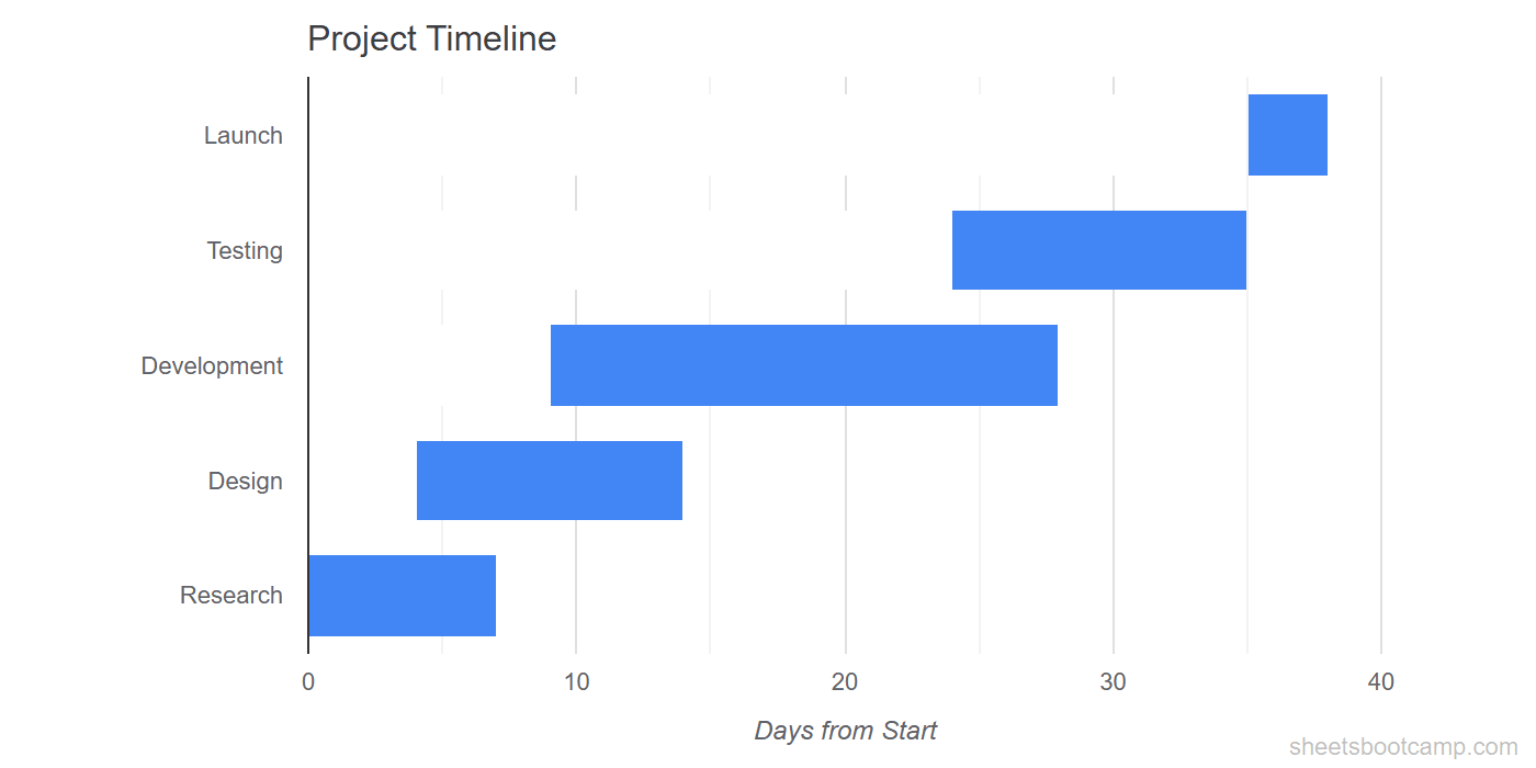
Select the Task names (A1:A6), Start Offset values (E1:E6), and Bar Length values (F1:F6). Hold Ctrl (Cmd on Mac) to select non-adjacent columns.
Go to Insert > Chart. In the Chart Editor Setup tab, change the chart type to Stacked bar chart.
The chart displays two stacked segments per task: the Start Offset segment (which positions the bar) and the Bar Length segment (which shows the duration). At this point, both segments are visible and colored.
4
Hide the offset series
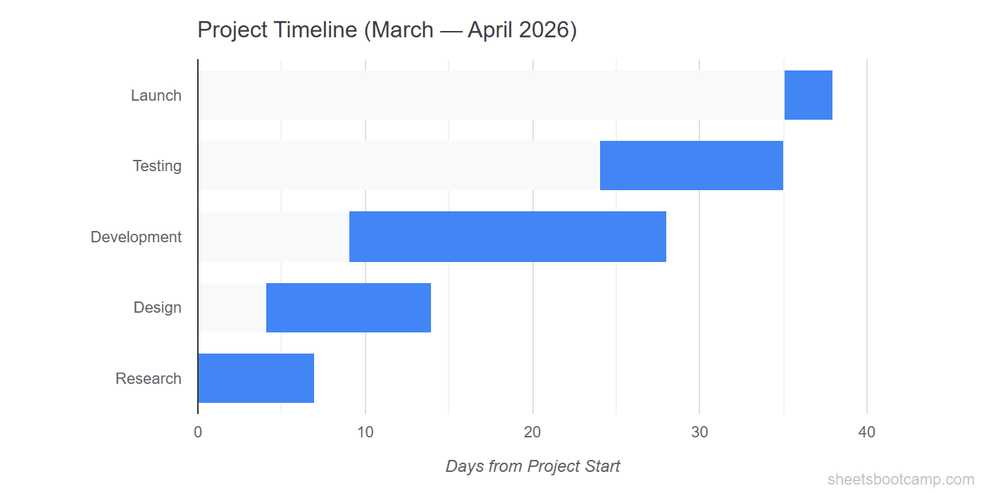
Double-click the chart to open the Chart Editor. Go to Customize > Series.
- Select Start Offset from the series dropdown
- Change the fill color to white (or match your chart background)
- Set the border color to white as well
The Start Offset bars disappear. What remains are the Bar Length bars, each positioned at the correct start point along the timeline. The result is a Gantt chart.
Tip
If your chart background is not white, match the offset series color to whatever the background is. The goal is to make the offset bars invisible against the chart area.
How the Stacked Bar Trick Works
Google Sheets does not have a Gantt chart type. The workaround uses a stacked bar chart with two data series stacked end to end.
The first series (Start Offset) acts as an invisible spacer. It pushes the visible bar to the right by the number of days between the project start and the task start.
The second series (Bar Length) is the visible bar. Its width represents the task duration in days.
When you stack these two series and hide the first one, the visible bar starts at the correct position on the timeline. Research starts at day 0, so its offset is 0 and the bar starts at the left edge. Development starts at day 18, so 18 days of invisible spacer push the bar to the right before the 21-day duration bar appears.
This is the same principle behind every Gantt chart built in spreadsheet tools. The offset-and-duration pair gives you precise control over bar placement without needing a specialized chart type.
Customize Your Gantt Chart
Task Bar Colors
Under Customize > Series, select the Bar Length series and set a color. To assign different colors per task, you need a separate series for each task or use conditional formatting on the source data as a visual reference alongside the chart.
For a single-color Gantt chart, pick a color that stands out against the white background. A medium blue or green works well.
Axis Labels
The horizontal axis shows day numbers by default (0, 10, 20, etc.). To make the axis more readable:
- Add a chart title like “Project Timeline: March-April 2026” under Customize > Chart & axis titles
- Label the horizontal axis “Days from Project Start”
- Remove the vertical axis title if the task names are self-explanatory
Gridlines
Under Customize > Gridlines and ticks, reduce the number of gridlines for a cleaner look. Major gridlines every 7 days can represent weekly intervals.
Milestones
To add a milestone, insert a row where the Start Date and End Date are the same (or one day apart). The bar appears as a thin vertical marker on the timeline. Label it with the milestone name in column A.
Chart Size
Gantt charts work best when wide and not too tall. Resize the chart by dragging its edges so the timeline has room to spread horizontally. A width-to-height ratio of roughly 3:1 keeps the bars readable.
Tips and Best Practices
-
Sort tasks by start date. List tasks in chronological order so the Gantt chart reads from top to bottom. Google Sheets bar charts place the first data row at the bottom, so reverse your sort order if you want the earliest task at the top.
-
Use date formulas for dynamic dates. Instead of hardcoding dates, reference them from a project plan. When deadlines shift, the chart updates automatically because the helper formulas recalculate.
-
Keep task names short. Long task names crowd the vertical axis. Use concise labels like “Dev” or “QA” and add detail in a separate column that is not part of the chart range.
-
Add a TODAY marker. Create an extra series with a single value equal to
=TODAY()-$B$2and a bar length of 0.5. Color it red. This thin line marks the current date on the timeline. -
Group related tasks with blank rows. Insert an empty row between project phases (e.g., between Planning and Execution). The chart shows a gap, creating a visual grouping without extra formatting.
Related Google Sheets Tutorials
- Google Sheets Charts: The Complete Guide: Overview of all chart types, creation, and customization basics
- How to Make a Bar Chart: Create horizontal bar charts for category comparisons
- Date Functions Guide: Calculate durations, add days, and format dates for timeline data
- Conditional Formatting Guide: Add color-coded visual cues to your project data
Frequently Asked Questions
Does Google Sheets have a built-in Gantt chart?
No. Google Sheets does not have a dedicated Gantt chart type. You build one by creating a stacked bar chart with two series: a transparent Start Offset series and a colored Duration series. The result looks like a Gantt chart.
How do I make a Gantt chart in Google Sheets?
Set up your task data with Task, Start Date, End Date, and Duration columns. Add helper columns for Start Offset (days from project start) and Bar Length (duration in days). Create a stacked bar chart from these columns and hide the offset series by making it white.
Can I update the Gantt chart when dates change?
Yes. Since the helper columns use formulas that reference your dates, changing a start or end date recalculates the offsets automatically. The chart updates to reflect the new timeline.
How do I add milestones to a Gantt chart?
Add a milestone row with the same Start Date and End Date (duration of 1 day). The bar appears as a thin marker on the timeline. You can also use conditional formatting on the source data to highlight milestone rows.
Are there Gantt chart templates for Google Sheets?
Google Sheets includes project timeline templates under File > New > From template gallery. You can also build your own using the stacked bar method described in this guide, which gives you more control over the layout and formatting.
You've googled this formula before. Probably more than once.
The Bootcamp is a real Google Sheet that grades every formula the moment you press Enter. 193 exercises across 9 modules, the 10% of Sheets that does 90% of the work. One payment of $29.
Get It for $29 Get the Bootcamp for $2930-day refund. Reply to any email and you get your money back.
Not ready to pay? Try Basic Training free →